Between 2014 and 2016, I led a project to conceive and deliver upgrades and efficiencies to a portfolio of 180+ news web sites and product verticals through a carefully planned system of modular, responsive layouts, page templates and UI controls in a way which allowed them to be quickly reused and easily themeable.
Today, this would be known as a design system.
Context
Johnston Press (now JPI Media) are a regional news publisher, home to 180+ news titles, ranging from national and regional institutions like The Scotsman and Yorkshire Post to hyper-local free-sheets like the Wharfe Valley Times and Hayling Islander.
In 2012, I was hired to establish and develop a digital design capability, setting the standards and principles for design during a critical phase of digital transition within the company.
During this time, the JPDNA became a pivotal strategic play in this program at a time when the company were suffering crippling debts of around £350 million.
The project delivered sweeping efficiencies across the portfolio, significantly reducing product design and development costs, doubling velocity and providing flexible foundations for rapidly creating new digital products.
In 2016, the JPDNA enabled the business to commit to creating a digital destination for the 'I' newspaper in just 6 weeks, which subsequently went on to win multiple media awards, including The Drum's Online Media award for 'Best Designed Site' 2 years after it launched.
The brief
In early 2014, just as responsive web design (RWD) was solidifying it's place as the defacto solution to delivering mobile and web experiences efficiently, Johnston Press brought in a new CPO, Jeff Moriarty, who had led the development of the very first responsive news website at The Boston Globe.
Unsurprisingly, the brief he gave me when he joined went something like this ...
We need to design The Scotsman responsively, in a way we can then reuse it for other sites Jeff Moriarty, CPO
Interrogating the brief
Of course, this was music to my ears and the very challenge I'd been eagerly awaiting since taking up the role at Johnston Press.
As such, I had a deep backlog of design issues to address as part of this.
Despite a well-intended, print-led revamp of the websites prior to my arrival there were obvious areas in need of improvement.
With the style and structure closely mirroring the print designs, a variety of legibility and display issues emerged.
Page templates were static, inflexible and often imbalanced, leading to many long, yet largely empty pages, save for the multitude of ad formats.
Theming had been implemented in such a generic manner that each news brands' identity was largely undetectable beyond a white logo in the masthead.
From a usibility perspective, the homepage carousels had unfathomable interactions and display advertising did its level best to disrupt the ability to read content and navigate the sites.
With a highly inflexible CMS, mobile subdomains propped up by an antiquated code-base and much of the styling hard-coded into the pages, iterating across the portfolio was painful and costly.
The bottom line was the business needed to find ways of becoming far more flexible and efficient in order to maintain their digital titles.
With the CPO's recent experience in responsive design and his passion for innovative technology, there was an open opportunity to do something quite transformational...
Research
At the time, the term ‘design system’ wasn’t commonplace and as such there wasn't a great deal of well-documented examples to take influence from.
BBC's GEL was held aloft as the poster child of 'living style guides' and The Metro had recently launched a responsive news site which, while simple, provided a great local example of a responsive news website.
With previous experience and a deep interest in the creating efficiencies through the codification of design, I began exploring digital pattern libraries, tools and approaches that could support design at this kind of scale.
I soon discovered emergent ideas coming from the likes of Brad Frost, Harry Roberts and Stephan Hay on their approaches to a more modular, component-orientated way of working and began discussing these with my team and our off-shore development partners.
Planning
With a wide range of issues surfacing from code quality, (lack of) responsiveness, unsuitable typography and brand application, getting a green light to tackle all the areas in one hit was going to be difficult, yet entirely necessary, in order to take a systematic approach to relieving the business of the legacy it had incurred.
With the business carrying roughly £350m debt, every project it sanctioned was driven by a profound need to become more efficient.
With this in mind, it was of imperative for me to underline how taking a more considered, long-term strategic approach designing the flexible foundations for the digital portfolio would add value to the business for many years.
Collating all of my research and emerging solutions into a proposal of tangible benefits that could reset the digital product foundations, the first job would be to get the backing of the business.
The pitch
Before going further, I produced a short document titled 'JPDNA' outlining the concept, intentions, benefits and goals alongside a responsive HTML prototype of a Scotsman homepage and a selection of visuals of lower-level news titles.
The proposal immediately resonated with the product team and as such I was quickly put in front of the CEO to present the vision and the prototypes.
It's better than The Guardian! Ashley Highfield, CEO
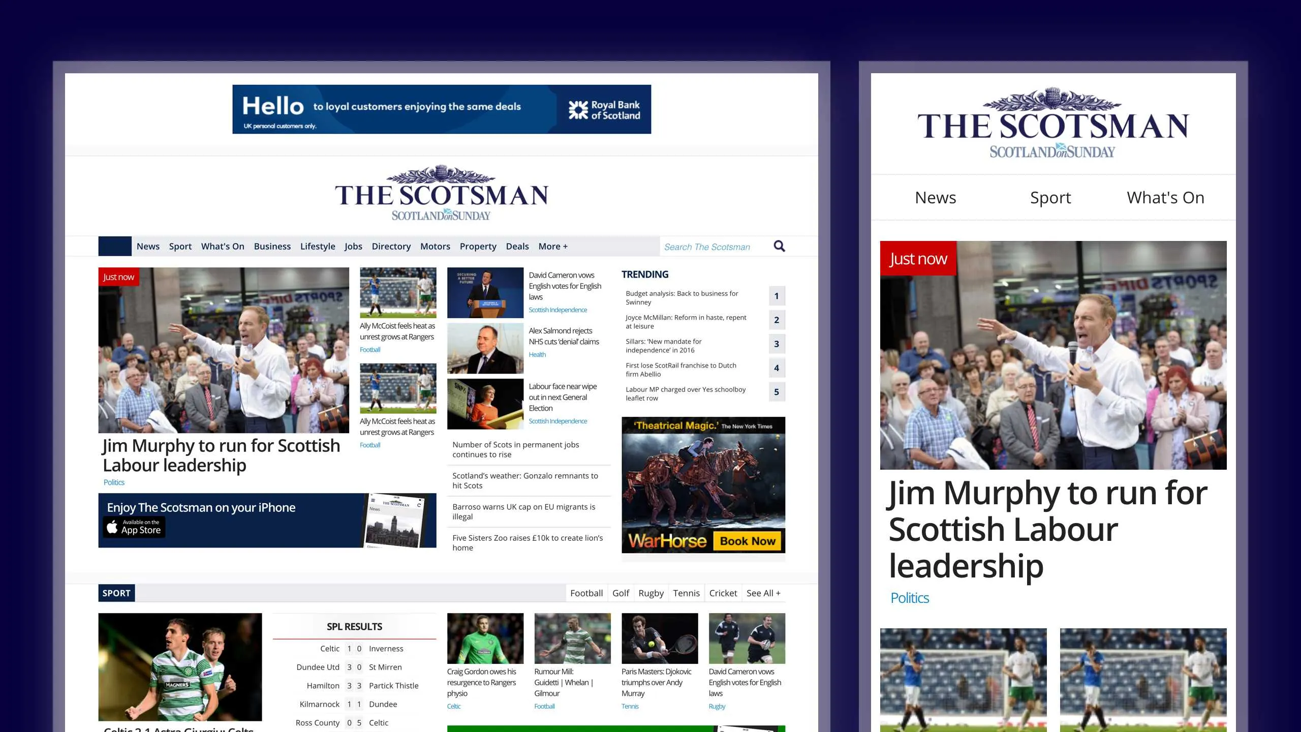
Whilst it was no where near the quality of the recently completed Guardian digital-first redesign, the prototype offered a tangible glimpse of what is possible and it was through this meeting we receive approval to proceed with support from the business and dedicated focus from product and development teams.
// I've since used some form of prototyping as a vital means to communicate a vision pretty much every pitch I've worked on. It has such an immediate, tactile way of demonstrating a design concept that it practically sells itself.
Development Discovery
We began the summer months of 2014 in discovery...
Our off-shore development team flew in from Romania for a week in order to begin asking questions of ourselves..
- What are the CMS constraints?
- What can we modularise?
- How can we phase the work?
- How can we most efficiently structure the CSS?
- SASS VS LESS?
- BEM Vs SMACSS?
- How can we best apply theming?
- What are our core patterns?
Beyond this, the FE Lead and myself began a successful, long-distance relationship on Skype, with daily calls, screen-sharing and discussions on possible approaches, co-coding and exploring solutions to the challenges we faced.
Concurrently, my team and I began getting in to the weeds of the challenge we'd just taken on.
Ideation
With a whole range of design challenges wrapped up in the project, we began working through possible approaches to improving layouts, typography, theming and generally immersing ourselves in the challenges of systematising design at this kind of scale.
We began a wall, exposing new concepts in the early stages of ideation in order to invite stakeholders to discuss, comment and input on design work freely.

Layouts
At the time, standard news layouts typically comprised of a main column for content and a right hand column for ads/commercials and sideways navigation.
Despite this being a widely adopted layout across many news sites, it also hosted a number of issues at scale, including problems of flexing with different content depths and a basic inability for the layout to be made responsive successfully.
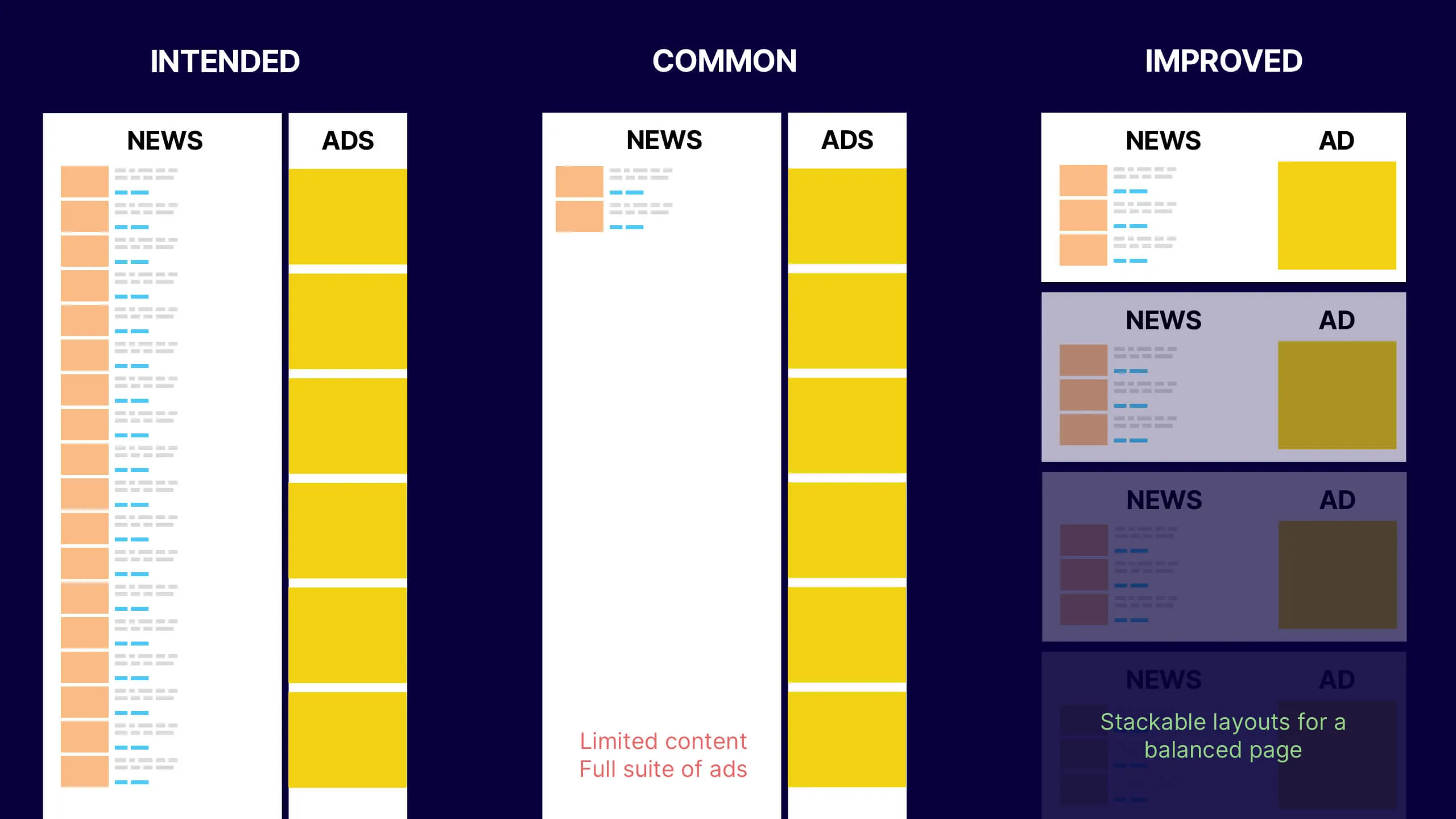
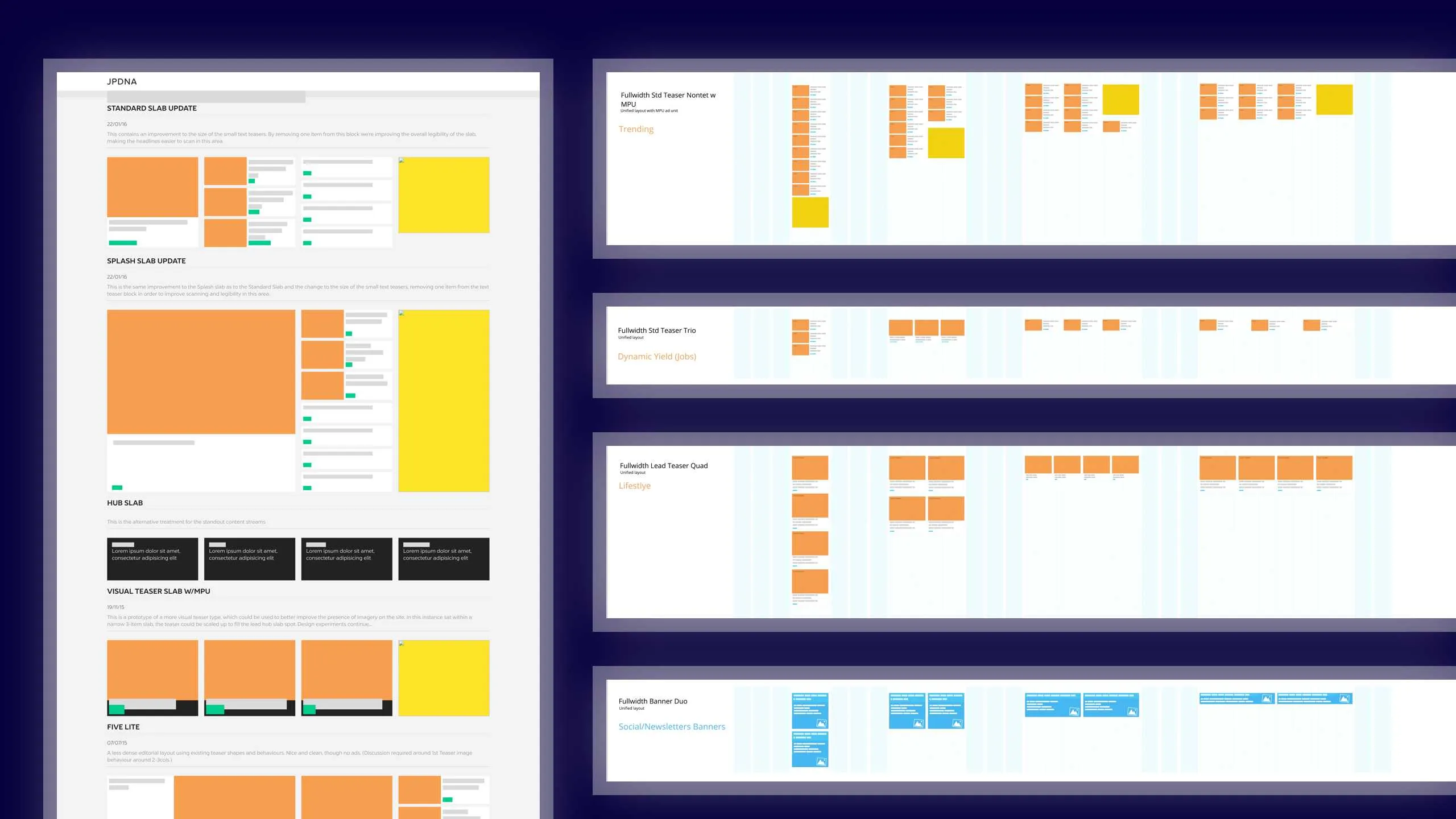
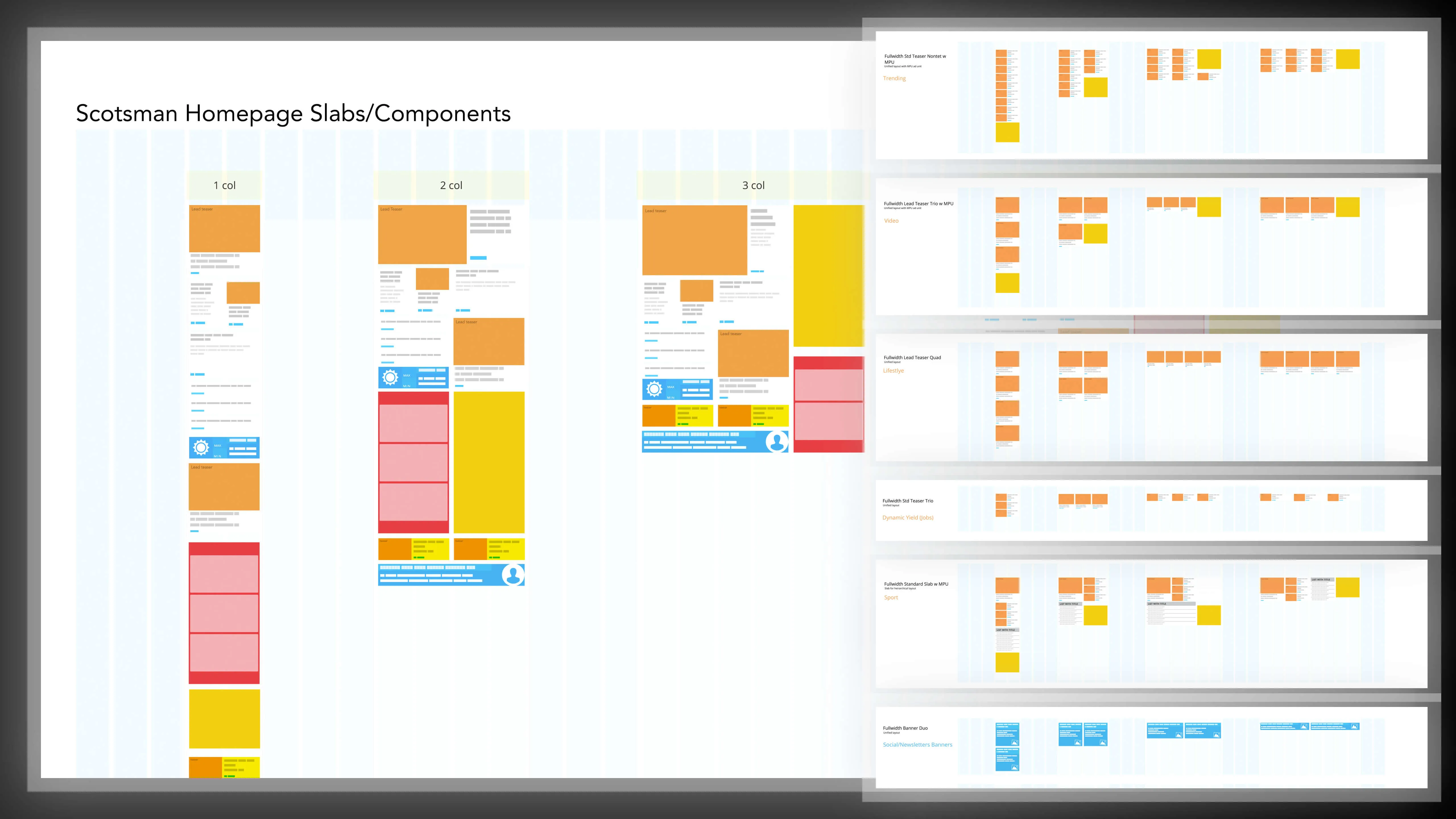
With this layout causing problems in a responsive context we had to fundamentally restructuring each page template, breaking apart the page into smaller, horizontal layouts, we eventually named 'slabs'.
These light-weight, stackable layouts became the building blocks of all our templates, enabling pages to to be constructed from a relatively small library of slab variants. This enable page-creators (typically editors or news product owners) to tailor layouts to the news agenda while ensuring that advertising remained interspersed throughout the pages on the responsive stage.
Over the course of the project we built 20+ versatile slabs that could populated with content from anywhere, customised through styling and stacked in many ways, to build bespoke pages for a wide range of digital projects.
These were committed to a slab library which was used for reference when considering new page structures.
Advertising
At the time, regional news’ primary business model was ad-based, with each page's purpose to maximise the opportunities for targeted advertising to be presented.
The most prevalent theme of user feedback was the negative impact of advertising on reading and navigating the sites presented us with a delicate line to walk between user needs and business value.
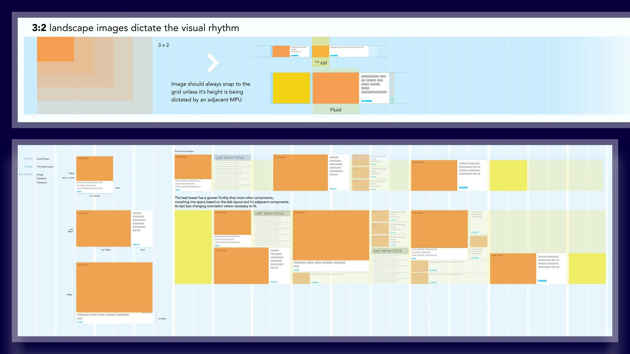
Having arrived at the idea of controlling page layouts with the slabs, we then began devising a grid and key content based on the rhythm of the MPU, digital displays most ubiquitous format, in order to better balance the distribution of content and advertising.
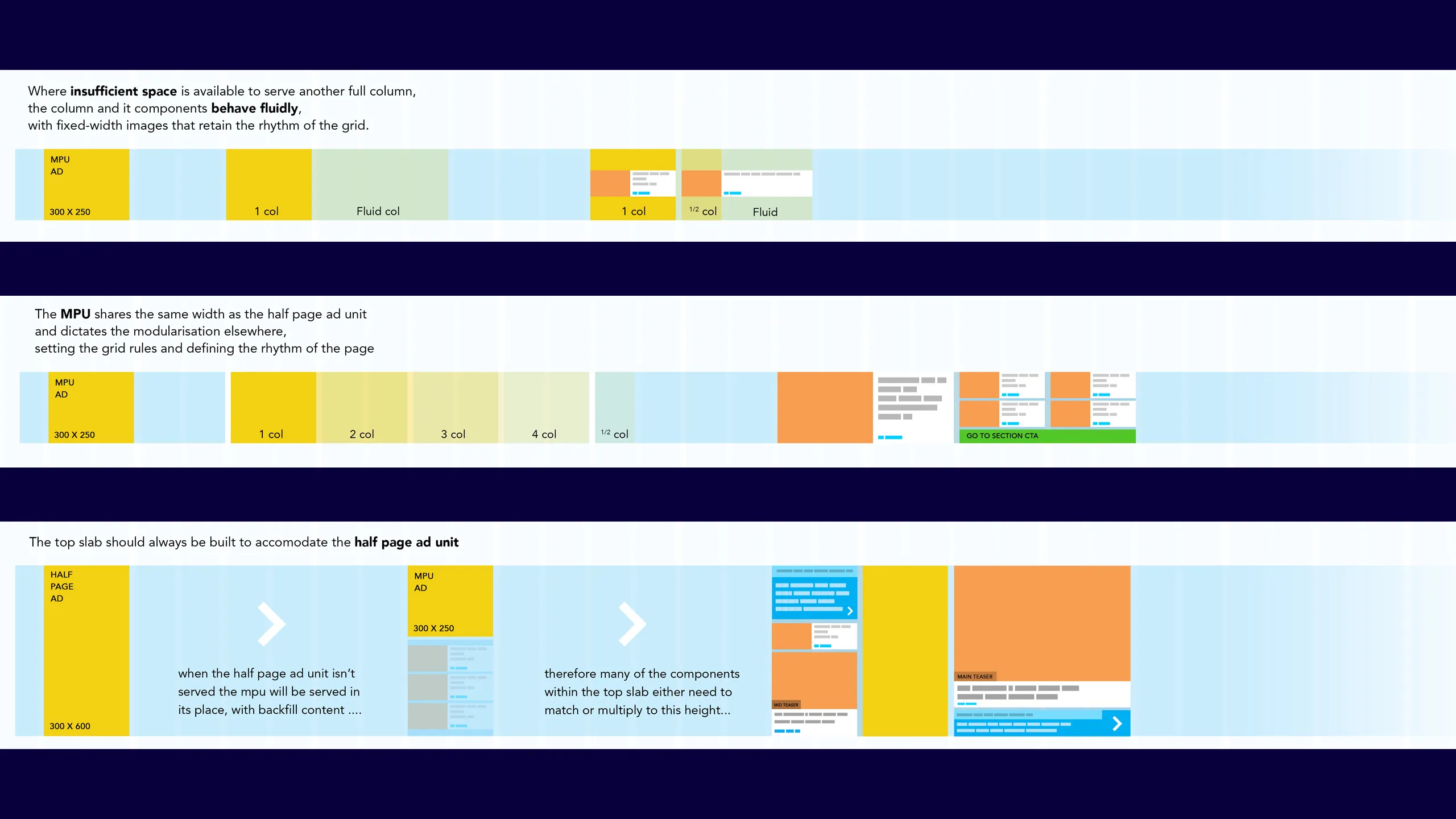
With this set, we were able to the create the rules and set the logic for the editorial content and imagery.
Modularity
Having identified the solutions to the some of the foundational problems we faced, we began to develop guides and principles for how news items, advertising and ui elements could fit and flow across the responsive stage, circling back with our development partners to ensure what we were outlining was technically possible.
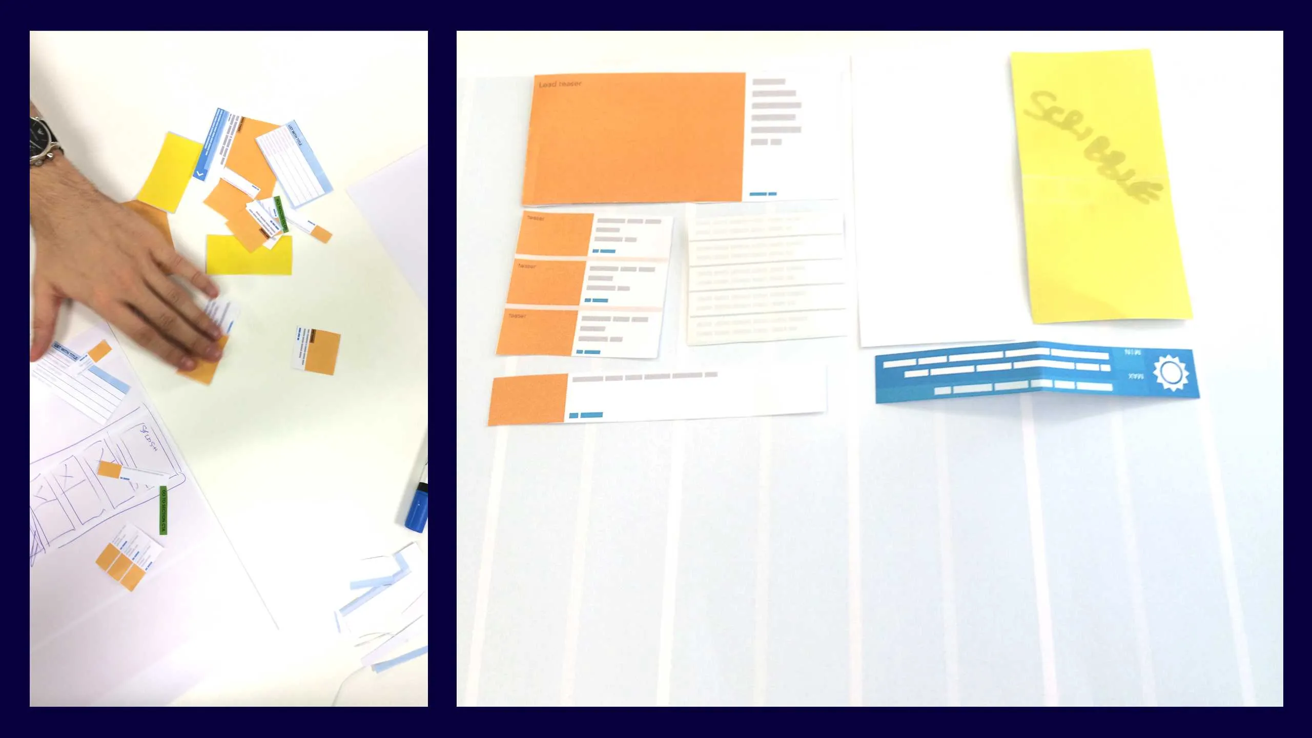
At the same time, we also decided it was helpful to print out the core module variants in order to create a paper prototyping kit. This enabled us to quickly work with teams and individuals to discuss and prototype layout ideas before committing to develop them.
Platform considerations
Prior to my arrival, the incumbent news sites had been redesigned, driven by a print-led refresh and an attempt to consolidate the titles into a more manageable group of products.
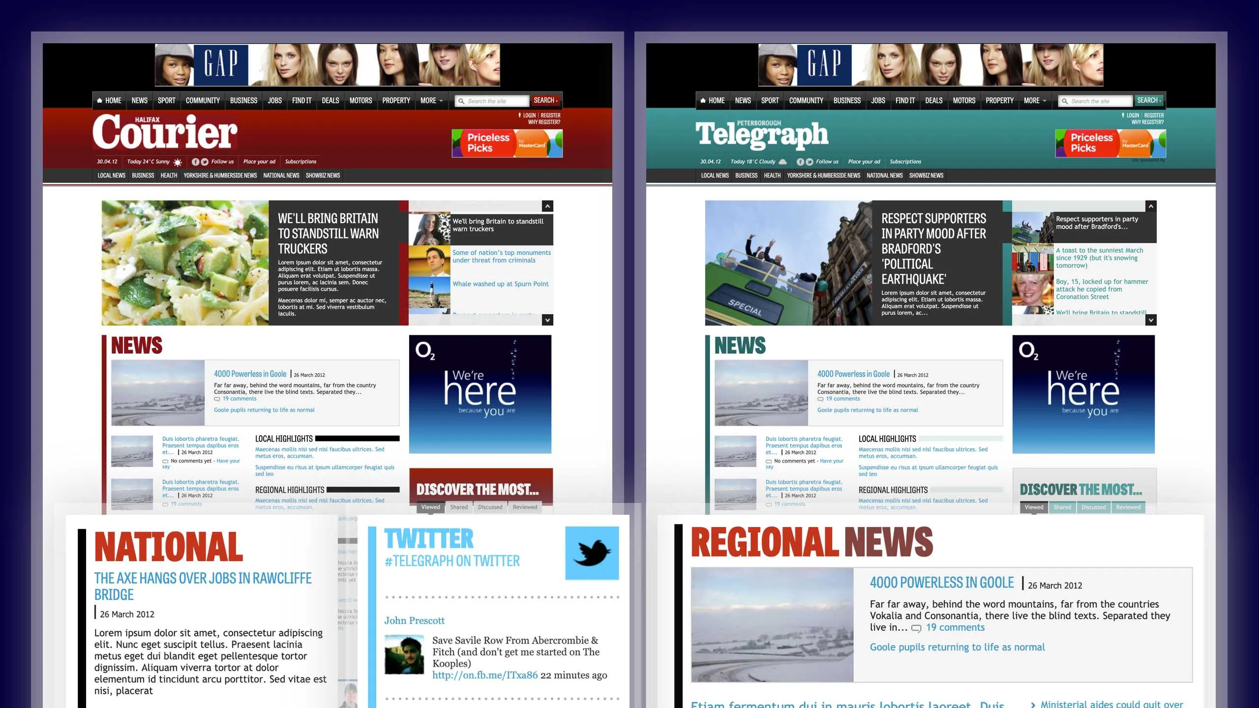
The print refresh had seen the portfolio of 180+ unique and individual news titles consolidated into a series of 'clusters', served by just 5 coloured themes and 2 font-families in order to become more economical with design and production.
Whilst this helped to significantly drive the operational costs down, the redesign hadn't been particularly welcome by the editors and sales directors who felt brand equity and identity had been compromised through the work.
Furthermore, the translation of this work to digital products had taken the news brands even further from their distinct origins and with no dedicated owner in-house to lead digital design at the time, some of the foundational principles of designing for the web got a little lost in translation.
With this in mind, I found it helpful to outline the necessary divergences between the print and digital platforms elements, mapping out key platform considerations to help crystallise and educate stakeholders on where I felt the acceptable points of alignment would support one and other.
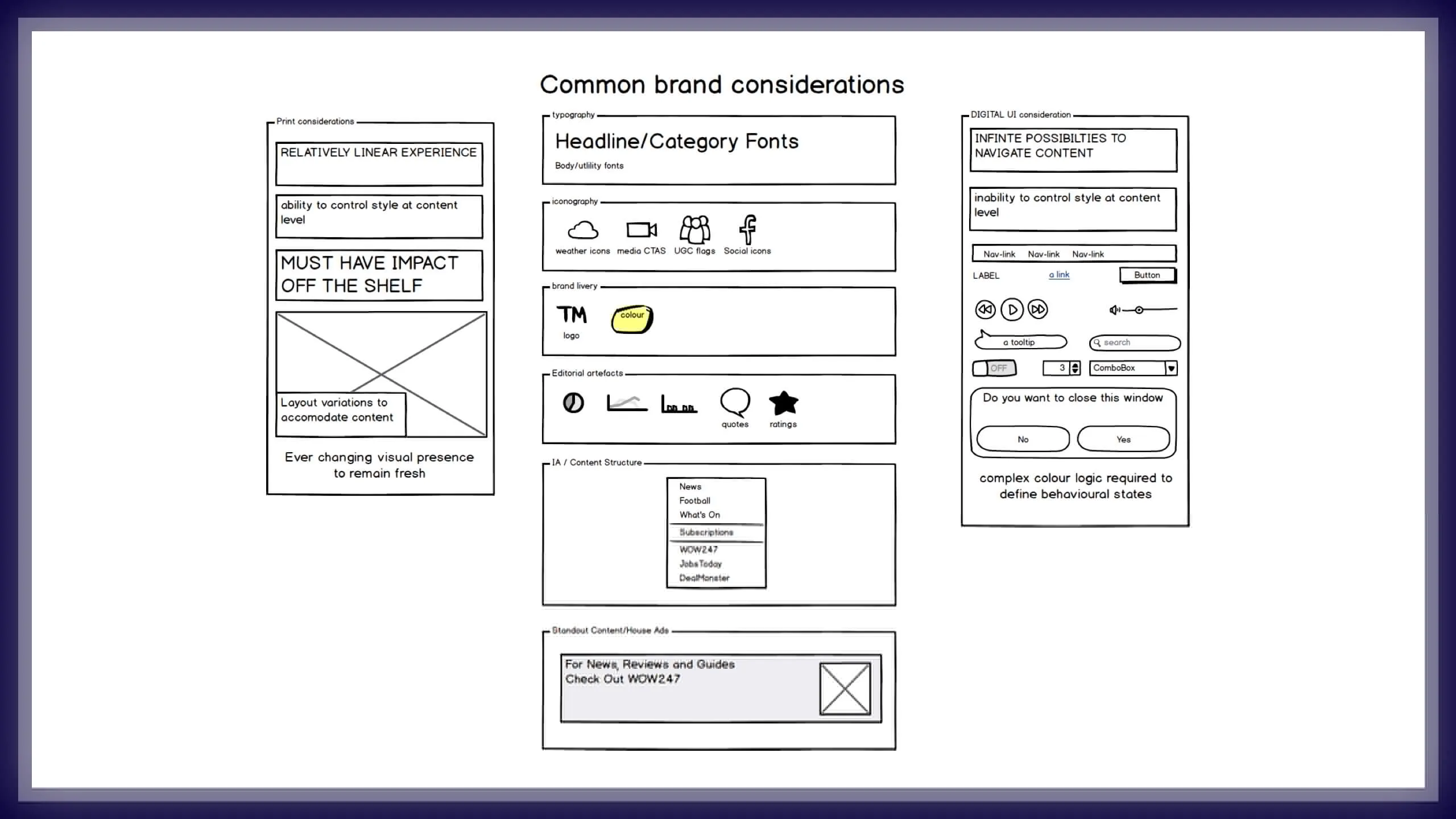
Theming
Visualising how a new site may look was fairly straight-forward process of reintroducing the original colourised logos and removing the heavily applied, 'cluster' colours from the sites, while selecting more appropriate reading and branded fonts for a digital format.
We'd produced some examples in Photoshop to arrive at a broad vision for our refresh, however the trick here would no doubt be systematising the colour and branding logic that could apply to the 180+ new sites in play.
With previous experience in WordPress theme design I saw a clear opportunity improve the theming capabilities currently in play and wanted to offer offer some bespoke configuration to all the news brands in order to bring back some of the critical identity that had been lost along the way.
As such we began exploring how to offer configurable typography and colour palettes could be driven by a consistent logic for styling each news site.

After an initial workshop on naming conventions, points of configuration, colour and typographical logic we moved quickly into prototyping using SASS variables (aka design tokens) to help establish the mechanisms that would enable us to re-skin the same templates programatically.
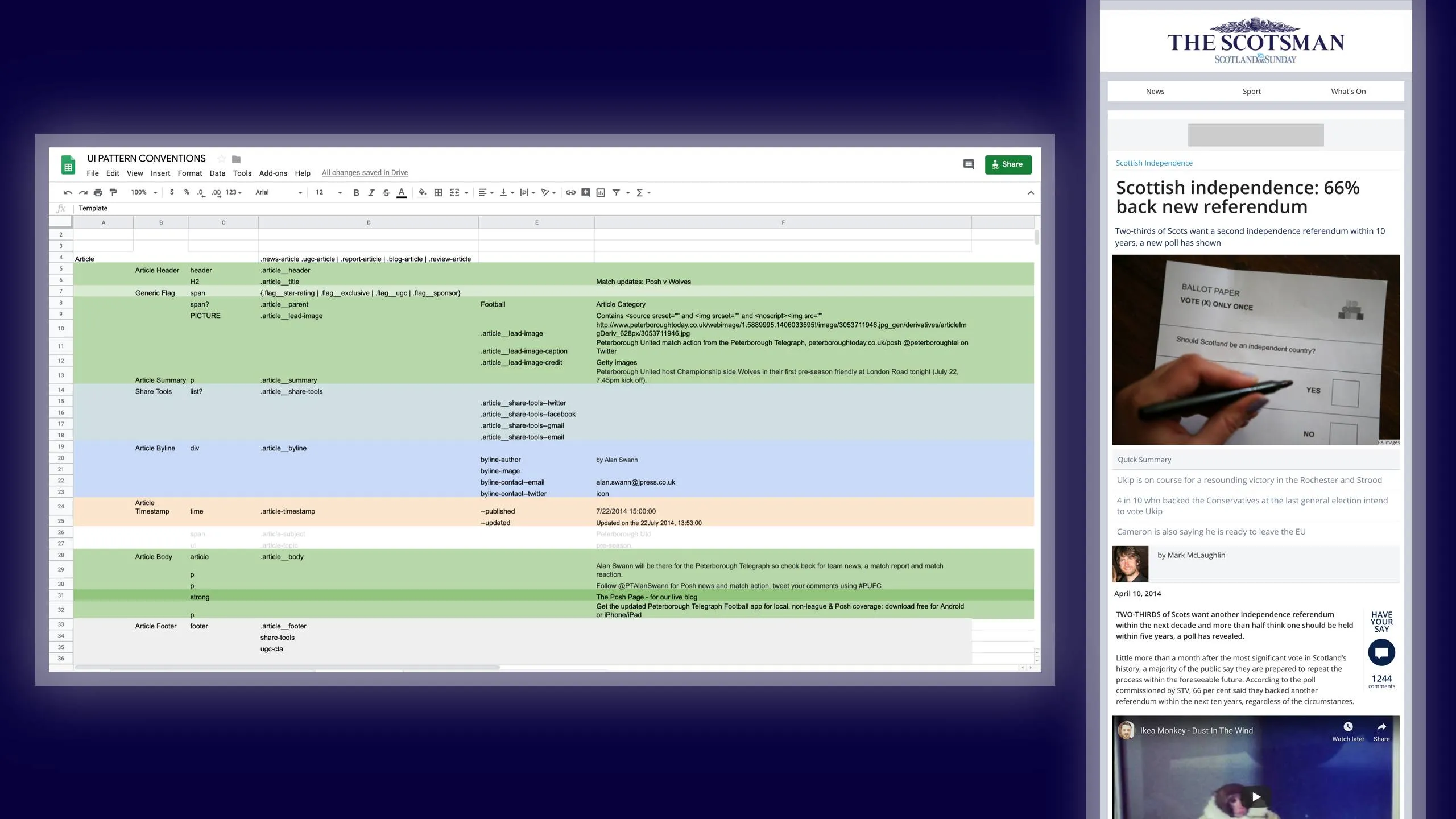
Article IA
Having validated the assumption that article pages were of higher value to the business in terms of engagement and sideways navigation than home and section pages, it was here we begun the development of the IA.
Since the article served as a generic template to the vast majority of editorial content across the portfolio achieving a flexible template here was vital. Equally, given these articles were expected to be served from multiple sources, with varying degrees of data consistency, it was also going to be complex.
With the concept of designing 'mobile-first' in ascendance and with the generally accepted practise of stacking information in a mobile context I began planning out the information architecture in spreadsheet. This allowed me to quickly move items up and down the stack to optimise the hierarchy. It also enabled me to creating variants to assess how the information stacked and flowed when information was unavailable from the CMS or APIs.
Finally, it also enabled me to work with the product owners and developers without conflating visual design issues with data availability.
Delivery Challenges
While the conceptual and philosophical work to build out a system for the portfolio was humming, the practical aspects continued to trip us up.
Under pressure to demonstrate progress on the Scotsman as quickly as possible whilst ensuring costs for the work were kept down, it was decided we should attempt to apply the new designs to the existing sites and refactor the code base, rather than start with a clean build.
This meant carefully planning and phasing the launch new responsive elements with the POs and engineering teams to avoid breaking the live sites, actively slowing us down, rather than helping us with velocity.
This challenge became further compounded when a new print design for The Scotsman was unveiled late in the development cycle alongside expectations that it should be adopted into digital product work.
Despite the disruption to an already challenging schedule, it gave us an early opportunity to stress test the theming capability and validate the flexibility of modular layouts with a series of in-browser mocks created over the top of the JPDNA layouts.

Validating theming
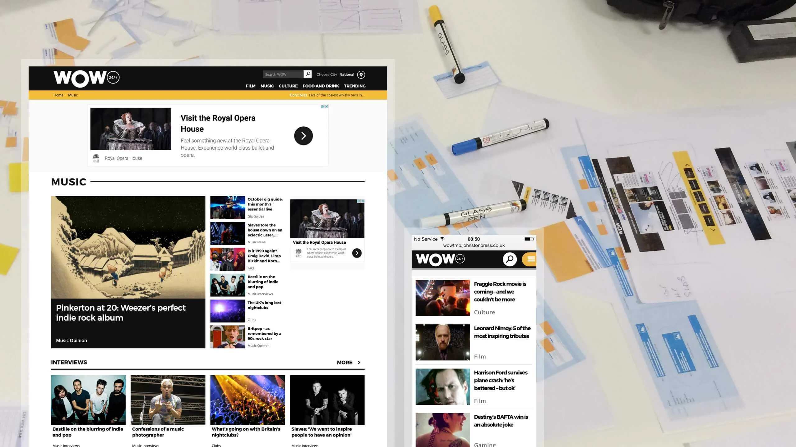
As we began refining our ideas for The Scotsman, we also began the incubating layouts and content patterns on WOW247, a small entertainments vertical portal we'd been working with some creative/product agencies.
Aimed a younger audience, it gave us an early opportunity to see how far we could push theming generic HTML elements and content patterns.
In doing so, this project contributed some of the simpler layouts to the 'slab library' and helped to better systematise the theming logic.
The First Releases
The Scotsman went live in October 2015 with a minor fanfare.
The response was positive and mobile traffic quickly improved.
WOW247 was also up and running using the same UI architecture, on a different CMS.
The benefits and possibilities began to look very plausible, but there was still lots of work to do.
The economy of scale
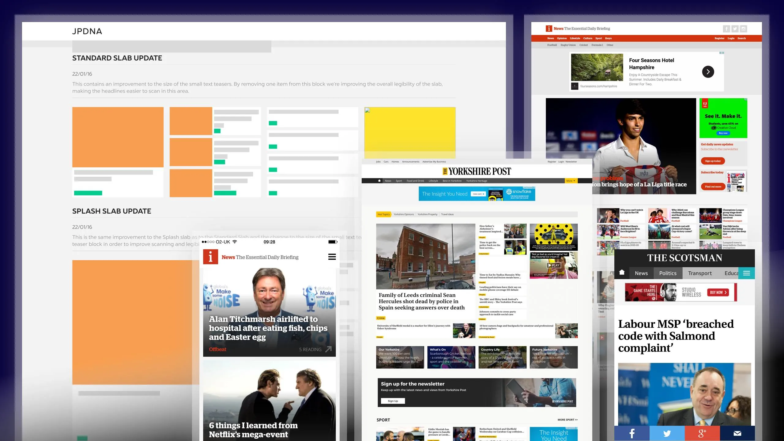
Where the first release surfaced a host of challenges we'd perhaps not anticipated, the following sites gave us an opportunity validate each issue as a portfolio wide concern and address them systematically going forward.
With the first release out and demonstrating improvements in engagement, our attention turned to the next news publication in the portfolio.
With a vast amount of the structural work covered off, albeit on top of a legacy code base, much of the work on the Yorkshire Post was geared towards refining and refactoring layouts, logic and theming to optimise our ability to create or change new sites as quickly as possible.
Concurrently, we also began looking into the CMS to begin building in flexibility to select different layouts and data for different news feeds.
With the remaining portfolio to release, our task now was focused on honing the end-to-end process.
Where the research, discovery and first implementations had taken a total of 12 months, each subsequent release became smoother, more formulaic, less stressful and obviously much faster too.
The system had bedded in nicely and the teams were finding it easy to work with.. With each release the expectation became greater as turn around got faster.
Subsequent releases ran much like this..
- Yorkshire Post - 3 months - refactored front-end, theming capability refined
- Sheffield Star & Portsmouth News - 1 month - including new layouts and tabloid typographic theming
- inews - 6 weeks - including new layouts, type configuration, brand configuration
- ... quicker ...
- ... and quicker ...
- ... and quicker ...
- ... until ...
- 12 sites a week - for which the design deliverables were a colour variable an SVG logo and a font-family reference, everything else was taken care of by the system.
Summary
So much more could be said on the successes of the project, which was a truly Herculean team effort.
I could go on (for days!) about how the JPDNA provided an efficient and extensible suite of content patterns and layouts along with systematic theming to a vast portfolio...
.. or how it brought product, design and development around a common approach to efficiently conceiving products ..
.. or how it empowered editorial teams and content managers to structure their own homepages, based on the day's news agenda ..
.. or how it quickly enabled third parties to begin working with us on the sites. ..
.. or how it enabled the business to commit to creating a digital destination for the 'I' newspaper in just 6 weeks, which subsequently went on to win multiple media awards, including The Drum's Online Media award for 'Best Designed Site' 2 years after it launched. (Actually I go on about that here!).
Of course, it was designed to be a game-changer but at the time we had no idea just how well it would evolve and how effective it could become.

I think if we knew at the time just how foundational design systems would become as a standard approach to design at scale I may have taken more time to brand it and evangelise the work, as so many are doing today.
Ultimately though, the JPDNA was not a marketing tool or a vanity project, but a workhorse designed for ensuring laser-focused efficiency when delivering and maintaining digital products at such significant scale.
After this role I moved on to Mendeley where led the redesign of their visual language and brand evolution of their productivity tools and eventually began research around a UI Framework to support the wider organisation.
That said, I'd love to take on another project of this scale.