Over the course of 12 months from 2017, I led the design team through a plan to bring sweeping changes to the quality, coherence and legibility of the Mendeley interfaces whilst setting new standards within the organisation on design best practices.
We did so much great work during this project that it’s been really hard to quantify, so I’m just sharing some highlights.
You have achieved so much here and have put in place such strong foundations when it comes to design systems that the org and our customers will benefit from for years to come.. Senior Director of Product Management, Elsevier.
Context
Mendeley’s product suite consists of a variety of productivity tools designed to help scientific researchers expedite their work.
The core offering is the reference management software, a tool to help academics to better organise, annotate and cite papers when compiling their research.
Around it sits a number of product concepts based on the idea of a Researcher Operating System (ROS), which included discovery/collaboration tools (ROS Social), data management tools (ROS Data) and careers/funding portals.
Prior to my appointment, the design team had been largely made up of blended UX designers, with UI and brand guidance officiated from Elsevier's central Masterbrand team in Amsterdam.
A role had been created to bring a senior UI designer into the team to sit across the suite to help improve the quality and coherence of Mendeley products.
The Brief
The initial focus was to be on 'ROS Social', which had been described to me loosely as a 'Facebook for scientists'...
These products had been built at pace in a well-intended attempt to faithfully adopt the Elsevier's Masterbrand UI guidance, yet for many reasons this was failing to result in a coherent experience.
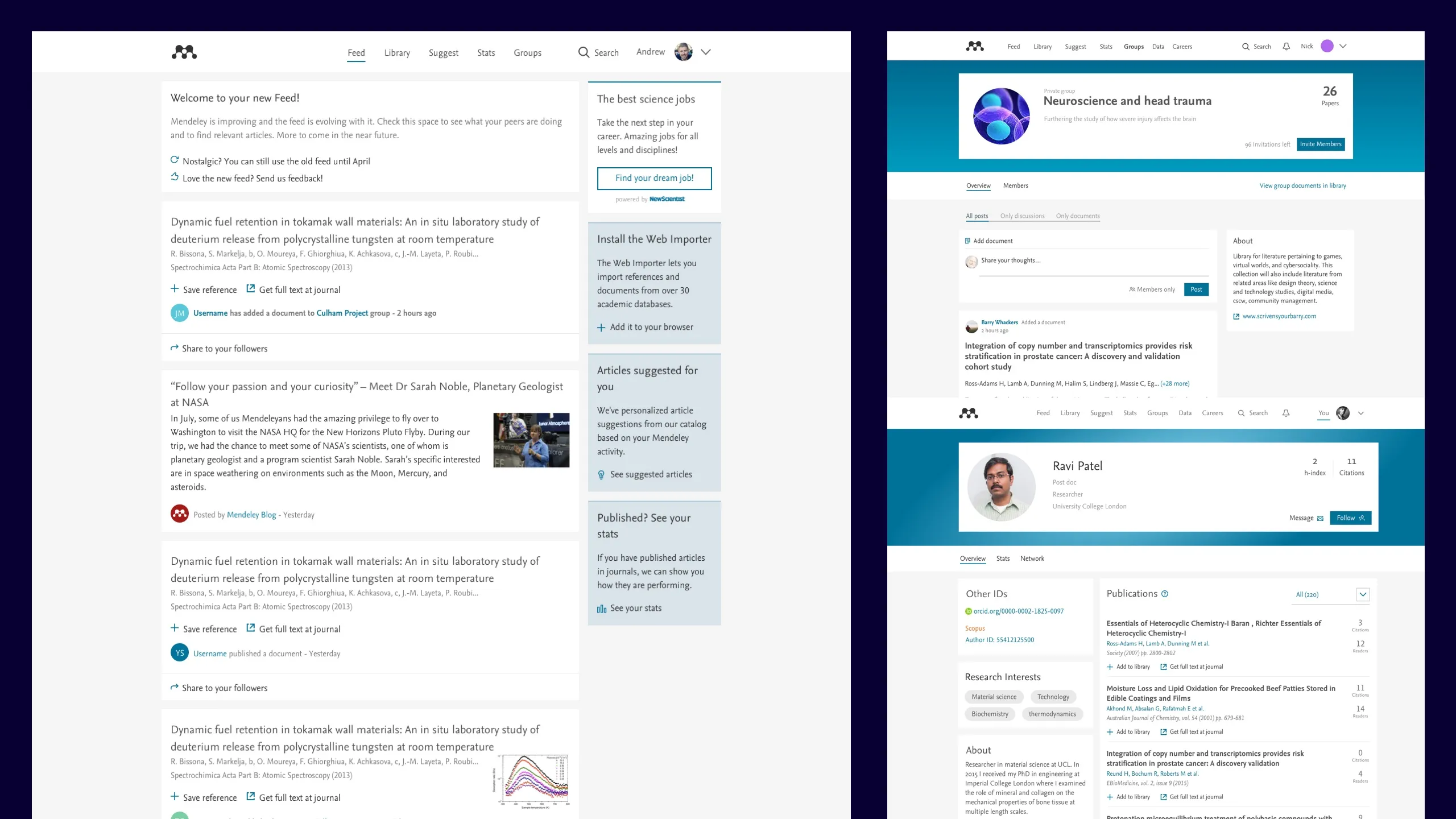
I was tasked to research and identify the problems and, leading the team, plan a program to create data-informed solutions that would solve Mendeley’s problems and remained aligned with the Masterbrand styles.
Research
I began by running stakeholder interviews with product owners, designers and developers to uncover more about their problems and concerns with the current approach, with some recurring themes coming back …
- There's too much white space
- There's not enough information on the page
- There's a lack of visual hierarchy
- It’s purpose isn’t obvious
- There are not enough colours to work with
- There's no consistent use of colour
- Too much orange!
- The checkboxes are weird!
Alongside these interviews I ran a heuristic evaluation in order to frame this feedback with my own understanding of the problems. My observations included ...
- A lack of visual range
- A lack of typographical range
- Some inputs and controls failed accessibility
- Some Inputs and controls were illegible due to heavily applied branding
- The Nexus font was imbalanced when set in buttons
- Everything was in card format, making pages difficult to parse
- Colour was being used inefficiently/inconsistently
- A lack of distinctive sign-posting
I discussed the feedback with the Masterbrand owner who was less than receptive, choosing instead to blame designers for a lack of skills rather than be open to possibilities with shortcomings within the guides.
As such, I established some clear problem statements to help frame the issues we were looking to solve and concluded any work going forward would need to be conducted as a team and that would require a carefully-crafted plan to methodically evaluate what’s working, what was not and how we can successfully evidence improvements to the legibility, consistency and quality of our designs.
Planning
Conscious of the possibility that there may be a rebrand of the products up-coming, I deliberately devised a plan to work through a series of brand-agnostic, product-agnostic design themes, intended to support the user needs of legibility, scannability and productivity, as this was truly where we could add value, regardless of brand.
At a high-level, it outlined a process for defining our content patterns, applying an interface, refining a supportive style and optimise the core the interactions within the product.

Alongside improvements to our UI output, we also planned to make operational improvements too and used these goals and principles to help us drive decision-making.
- An improved cross-product design process
- A more reliable design system/pattern library
- Clearer guides on all areas/aspects of design
- Swifter execution of designs due to improved process/principles
- More engaging product, wider, richer, more intuitive.
- Refocus designs’ attention on user-needs, not pixel pushing
Within each theme typically running over 6 weeks, we would work to fairly rigid plan in order to keep the focus tight and avoid conflating issues.
- Kick Off
- Brief the team, outline the focus
- Research
- Gather examples, evaluate divergences, highlight opportunities, competitor analysis etc
- Replay
- Findings, observations
- Consolidate/Ideate/Refine
- Work through design improvements, ensuring multiple options are considered
- Test
- options with users via 1-1 testing and via Usability Hub
- Present
- Present back to the team problem/exploration/resolution for sign off
- Document
- Capture outcomes to style guide/pattern library

Making use of the wider teams' bi-weekly design reviews to critique and keep other designers across the work we stepped through the project themes. To supplement the wider feedback, I installed a weekly UI Alignment meeting to ensure we could get into deeper detail amongst the UI team.
Each quarter, I would set OKRs alongside the ROS Social product teams to ensure we would be driving towards clear objectives.
Project highlights
As this was such an all-encompassing project, I’m just pulling out highlights here. I could go on for days about it but each one is a case study in it’s own right.
#1 Establishing the concept of content patterns
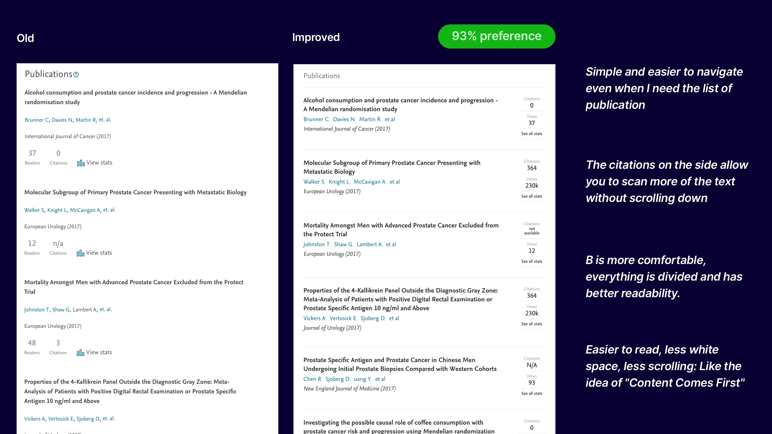
As with all informational products, content is most definitely the lifeblood and, as such, we'd begun a content audit even before getting official approval on the project.
There were clear issues with how we considered our content, both visually and architecturally and, by breaking out our key content patterns we quickly learned that without clearly defining our content patterns, we'd would struggle to consistently represent the most critical elements of our products going forward.
Upon gathering the examples from each area of the product set, it seemed that with each individual implementation, we'd somehow introduce a new, slightly inconsistent variant with everything that'd gone before it.
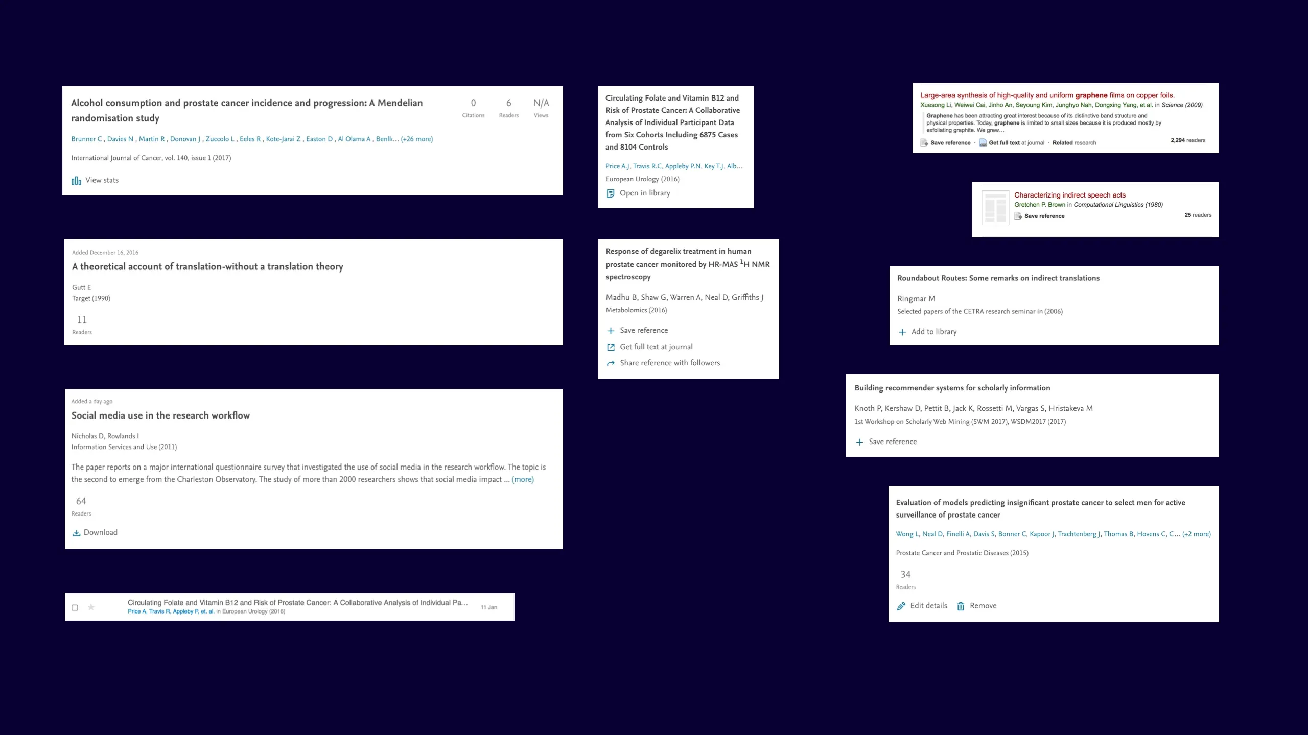
With attention on the themes and feedback we'd received when considering making improvements, we began to consolidate our content patterns with a focus on reducing white space, improving visual hierarchy and giving these integral patterns an instantly recognisable presentation.
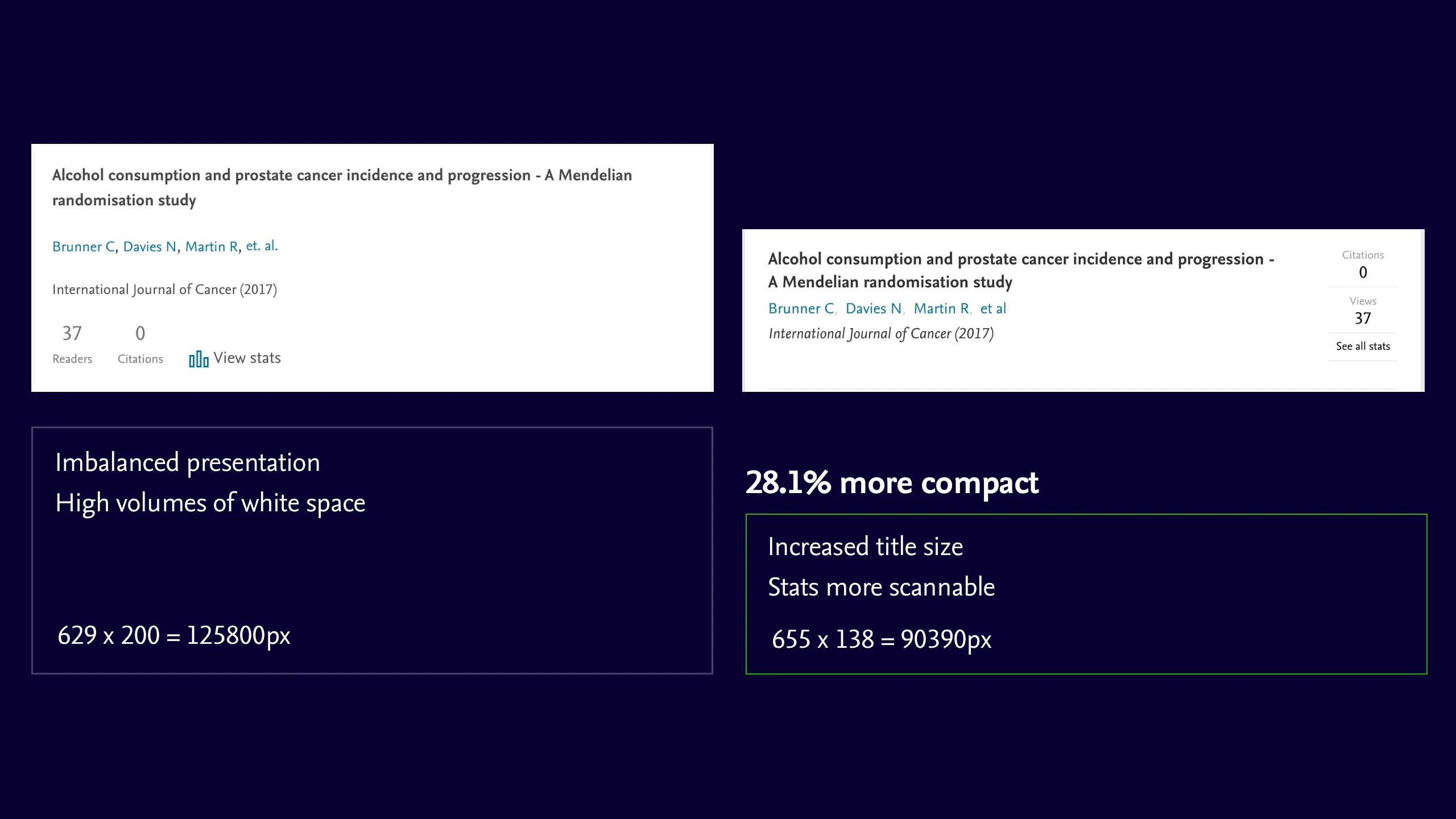
While making the changes was a relatively simple affair, it was important for us to evidence that our changes would be a valuable change to make across products, so enlisting Usability Hub for quantitative data and our in-house user-testing lab for qualitative feedback, with every piece we gathered data to help rationalise our proposed changes.
We stepped through a similar process for the other content patterns and began capturing the IA in the BEM syntax, to solidify our naming conventions and help developer hand-offs.
	// BEM structure for A Research Document

	block (the entity)
		__element (a part of the entity)
			--modifier  (a variant state of an element)
	---


	.document
		&__title

		&__author-list
			.list
				&__item
					--author-count
					--see-all-cta

		&__publication-metadata
			.list
				&__item
					--publication-title
					--publication-date

		&__metrics
			.list
				&__item
					--citations
					--view
					--see all-cta

		&__user-actions
			.list
				&__item
					--save-reference
					--get-text
					--share

		&__owner-actions
			.list
				&__item
					--edit
					--remove
This was highly successful process of reviewing, consolidating and aligning our core content patterns, which in-turn gave us some continuity to rely upon and enabled us to begin looking at other aspects of the design.
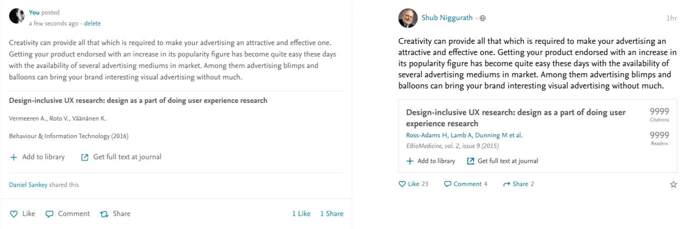
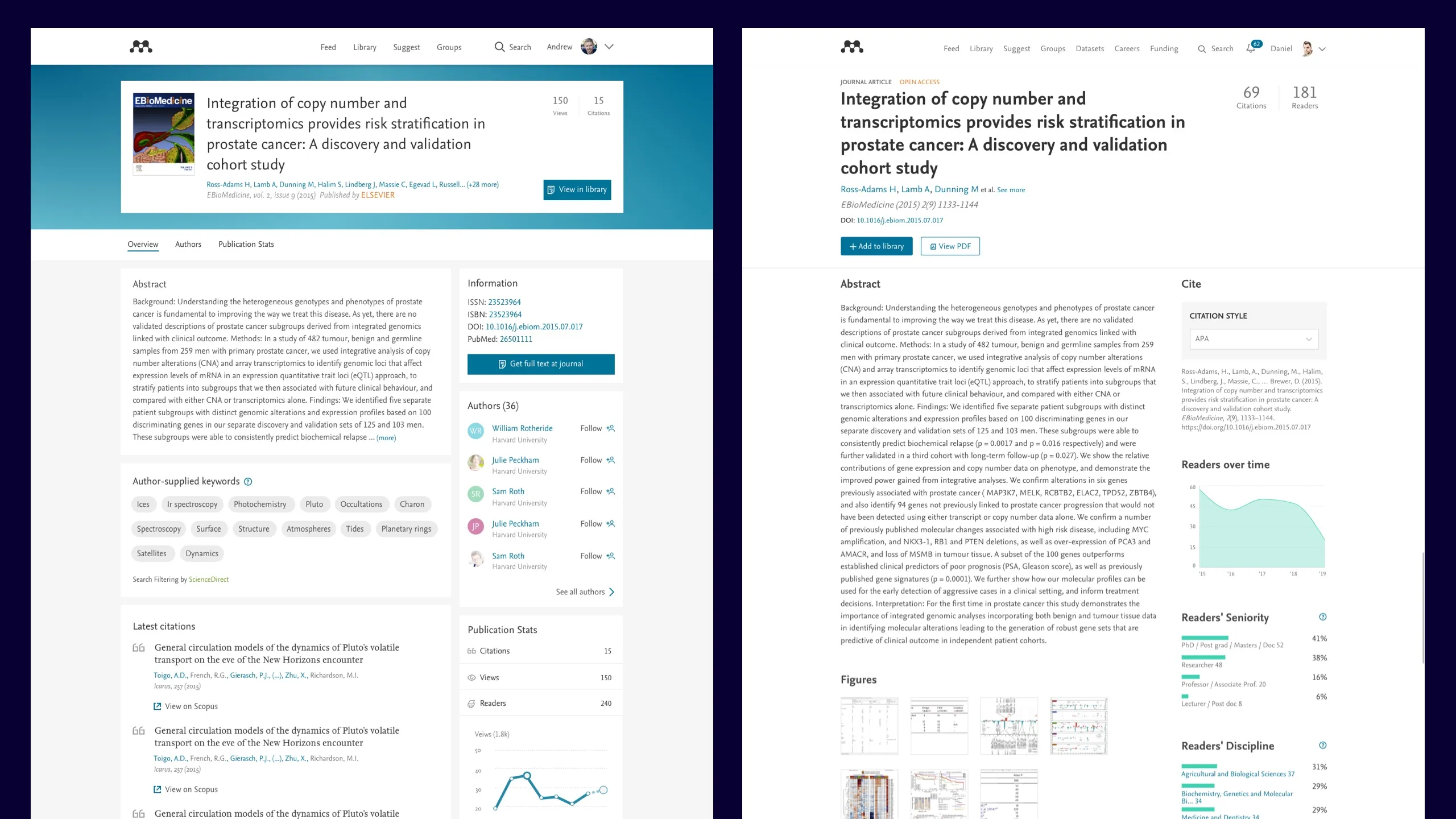
#2 Removal of the cards
The white cards really fragmented the pages and metaphorically weren’t being used correctly. They also contributed to the issues of content density by creating a need for employing both paddings and margins in order to space adjacent content. By condensing the content patterns and removing the cards, the interfaces started really beginning to make sense. Our users agreed.
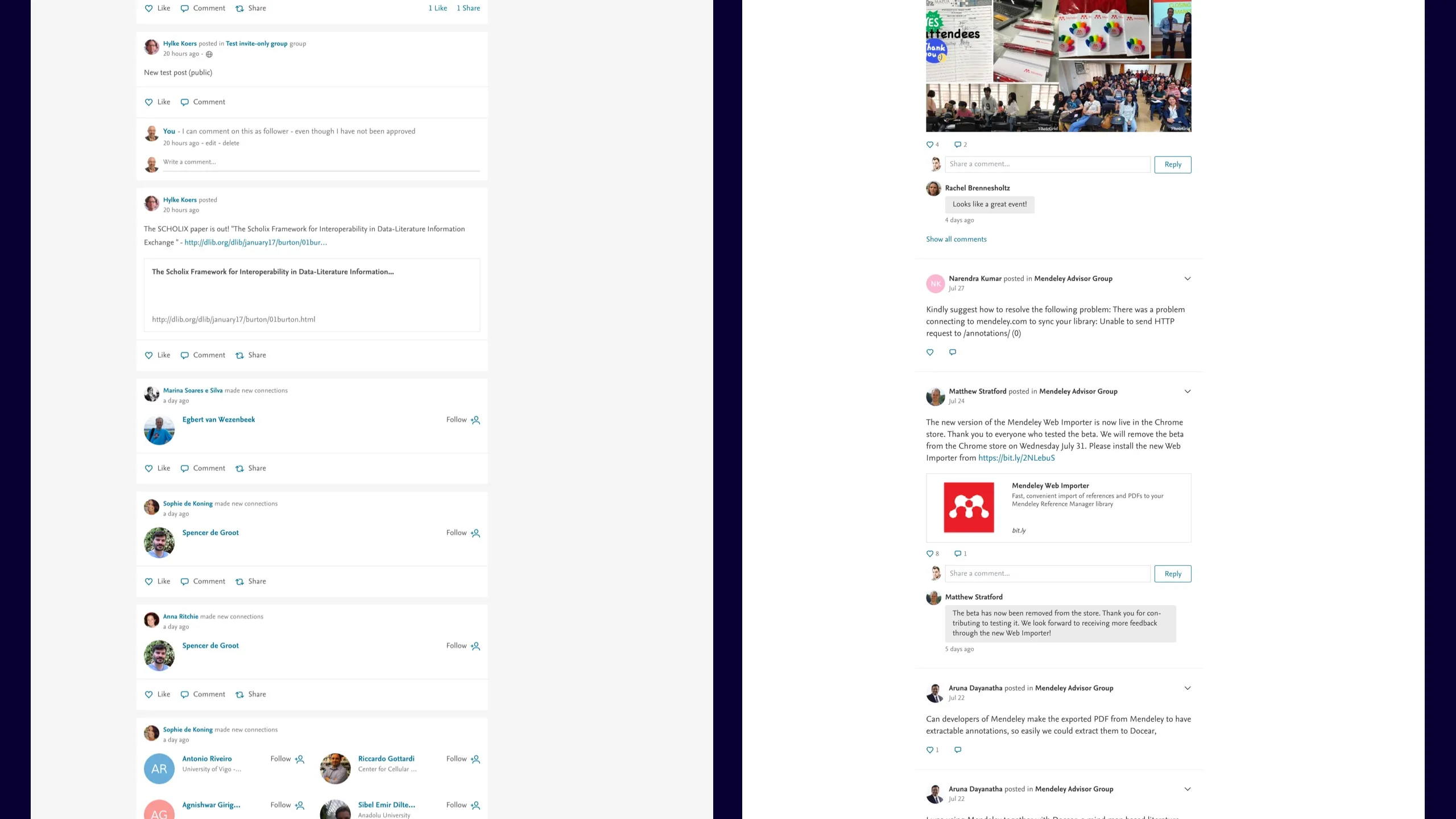
3# Removal of coloured headers
The blocked headers had been introduced to allow users to customise their profiles and groups, but this feature wasn’t being used which resulted in a large block of blue for no clear reason and it was obvious that the colour could be put to better use. Again, by simply removing the card and the background these pages began to make much more sense. Our users agreed.
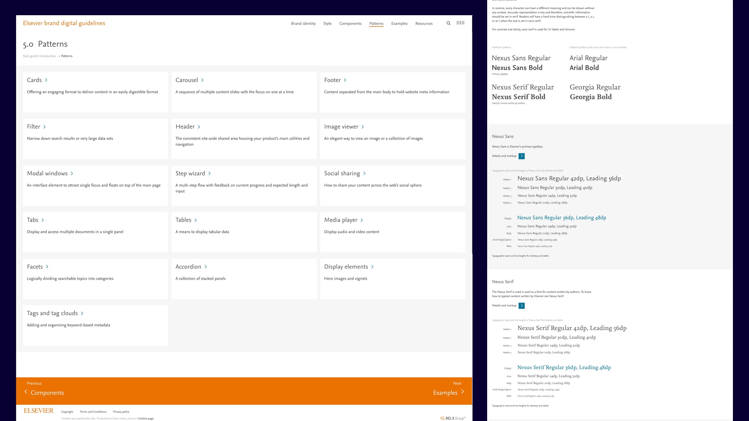
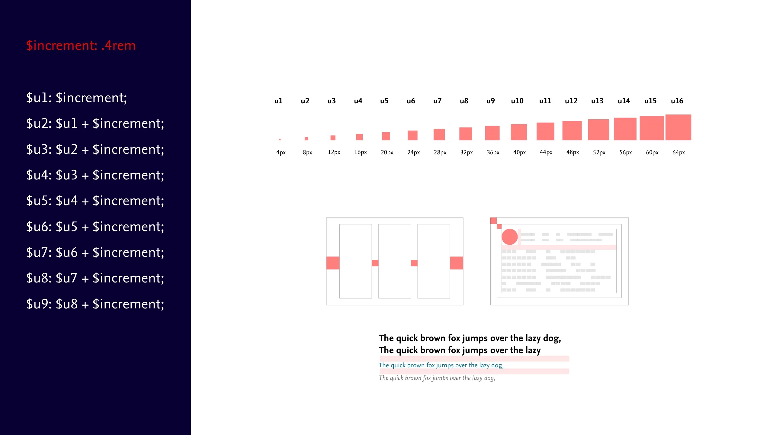
4# Introduced programmatic scales
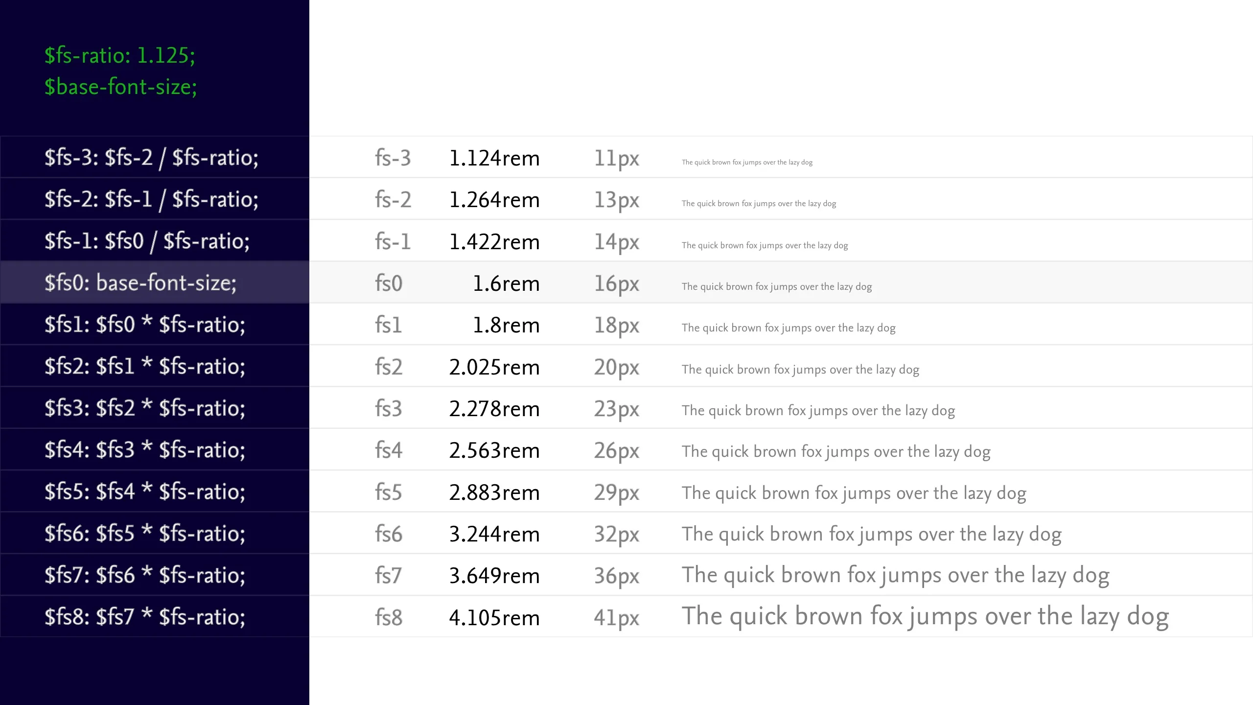
The limited type range the Masterbrand guidance offered wasn’t working in the context of a social news feed product. Instead of shoehorning new sizes into the existing range I championed the concept of a modular scale to promote flexibility, efficiency and consistency.
This allowed us to prototype and iterate our typescales as we figured out the optimal range for the product.
We extended the concept of using scales to better communicate space, typography and colour to reduce the number of bugs occurring throughout the products.
5# The conceptual UI Framework
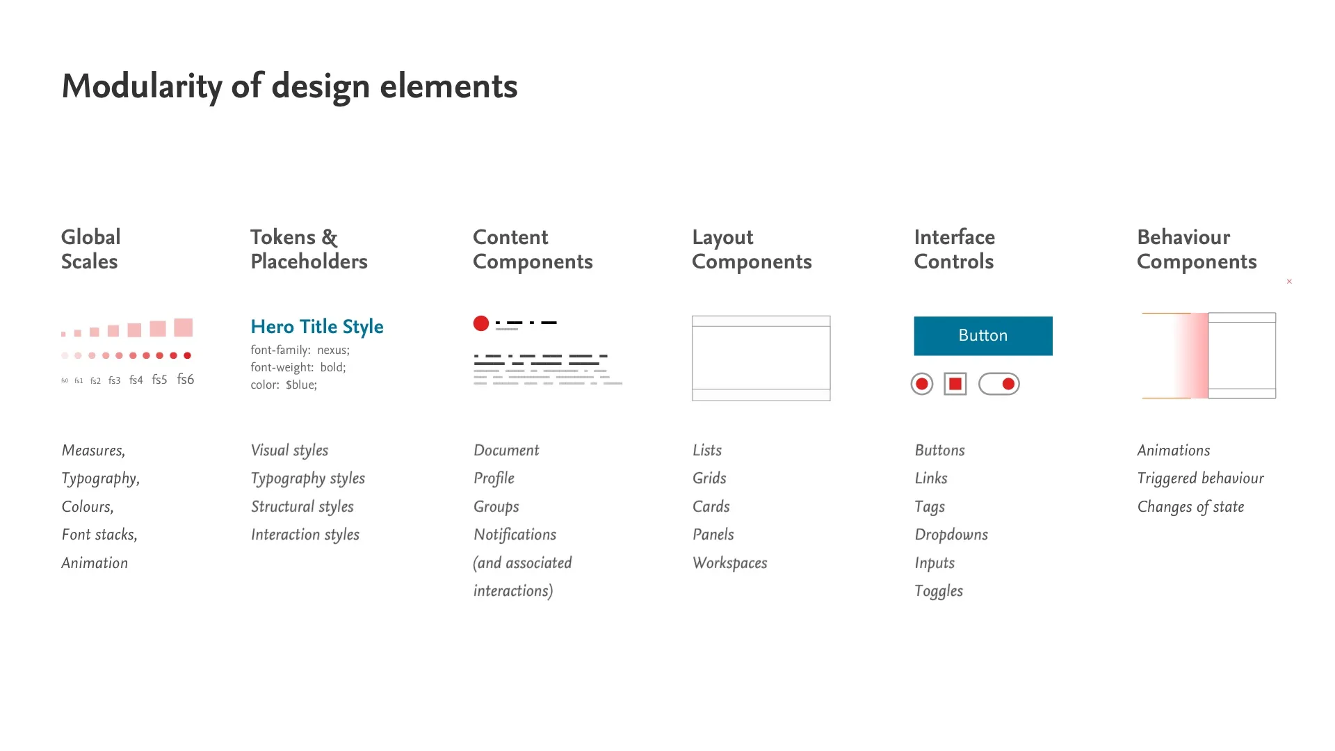
This is probably the most useful thing of all and something we extended when I began to work on the Elsevier UI Framework.
Over the course of the project, we established a conceptual framework for designing and conceiving UI elements, which enabled the team to be clear, consistent and highly modular about the UI designs they were producing, meaning far less time wasted recreating patterns and re-annotationing designs, freeing more time to spend on honing the user journeys.
6# Wider adoption and alignment

As the project began bearing fruit, other areas of Mendeley began looking to align with the program. The designers on the Reference Manager also began attending the UI alignment meetings and we began converging on a shared visual language between web and software products too.
Challenges
Despite great progress on the design theory, research, planning and validation, the initial application of this work was compromised an over-running technical project on the same product we were intending to launch on.
Under intense pressure from the business to release, this led to a rapid de-scoping of features as team members were being pulled off to begin work elsewhere (including myself!).
As such, during the last 3 months, we adopt a much leaner approach to refining and iterating the design work than the team felt comfortable with. Short-cutting the long-form due process of having clearly annotated, detailed hand-offs captured in Jira, to pairing with developers and QAs in-browser to overcome edge-cases and implementation bugs.
At this stage of the project I worked tirelessly with the product director, product owner, design director and product designers to agree on the minimal scope that would allow us to wrap up the project as quickly as possible to enable the team to move on to another project.

Outcomes
Despite significant challenges with the initial product realise, we doubled the primary engagement metric (Monthly Active Users) on the Feed. The conceptual framework, styles and patterns were largely adopted throughout Mendeley products.
The approach to tackling the visual design in a methodical, data-informed manner raised the profile of the Mendeley design team.
We subsequently introduced light-weight BAU process for monitoring and maintaining the work, with a weekly 30min UI Alignment meeting in place to discuss new designs, an Abstract set-up for version controlling Sketch files and a Slack channel for ongoing questions and discussion.
These conventions, practises and patterns are now being successfully used and developed beyond Mendeley and are largely regarded as the next-generation Masterbrand UI.
This work led to me being brought in to lead a wider piece of work consolidating efforts throughout Elsevier, the Elsevier UI Framework project.