In 2013, when Elsevier acquired Mendeley, a well-regarded reference management desktop app for academics, the news hadn't been well received by its users.
Elsevier had long-faced criticism from the scientific community who felt the high-cost of their journal subscriptions held academics and institutes to ransom over research papers they felt should be free.
Mendeley, on the other hand, was a free, dependable, publisher-agnostic productivity tool that researchers loved.
...I don’t want my search patterns to help Elsevier sell me closed science... When The Rebel Alliance Sells Out - newyorker.com
Acknowledging this sentiment, upon acquisition Elsevier had deliberately avoided any iteration to the brand or product, aware it could well damage the equity it had just purchased.
When I joined the company in 2016, 3 years had passed. Elsevier had spent millions building out teams and incubating new product verticals under the Mendeley brand with little concern for coherence and consistency. There was a sprawling brand presence taking a multitude of approaches.
The time had now come to give it some attention...
Interrogating/extracting the brief
- “Our marketing collateral needs a refresh“
- “We’re lacking a fully-formed set of design principles in order to help us build products that successfully exude brand identity with any consistency“
- “We’re struggling to communicate to our audience using the current brand assets”
- “We need a series of secondary colours in order to support the functionality of our products cross-platform”
- “We’re struggling to balance our brand colours with the Elsevier orange”
After a series of stakeholder interviews, I was able to better understand the drivers of the project and extracted a brief which essentially boiled down to a single statement that would help with focus and orientation throughout the project.
Ensuring this was restated at the start of each meeting would help us remain focused, frame our discussions and make decisions.
I quickly realised this was less of a rudimentary visual design task and one that required significant research, a delicate hand and a water-tight plan in order to help facilitate decision-making way above my pay-grade.
Planning
Given the seniority of the working group, a strong plan they could all quickly understand, communicate and rely upon was essential.
As the concept of 'design sprints' was in ascendance at the time, it seemed like a good framework to consider for the project. However, I quickly realised that the availability of the group would not allow us to work in such a focused manner, so we decided to loosely use the framework, but not the timelines as a process, with 3 distinct themes.
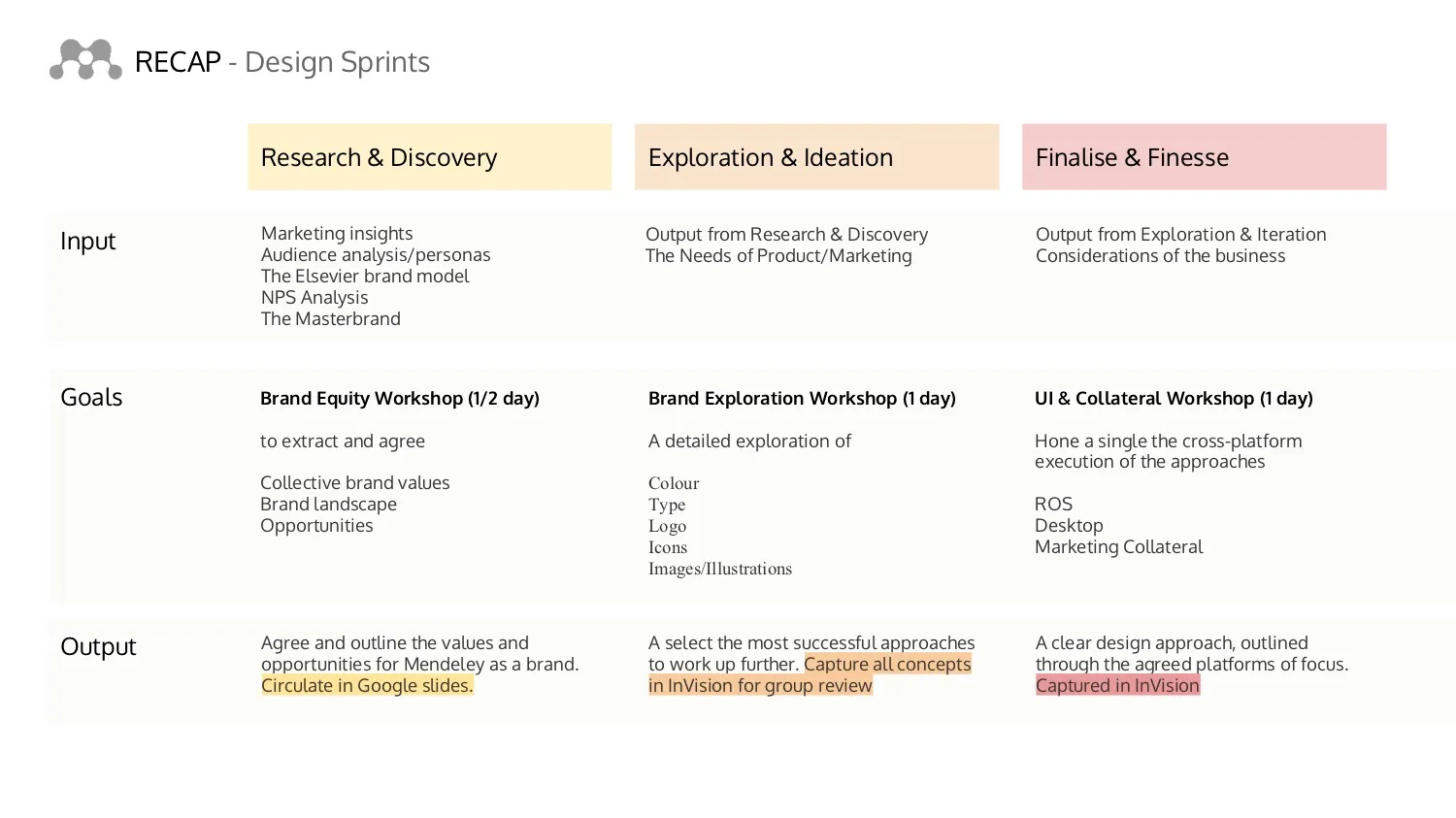
Research and discovery
It was clear from the interviews, there was a deep need to iterate the brand in order ensure it was more systematically aligned with Elsevier, if nothing else than for the operational efficiencies when producing marketing collateral and maintaining continuity across channels.
That said, it was equally important not to lose sight of what users regarded as important to them. Thankfully, the marketing team had already amassed a series of reports to help gather insights that could help us move forward. These included,
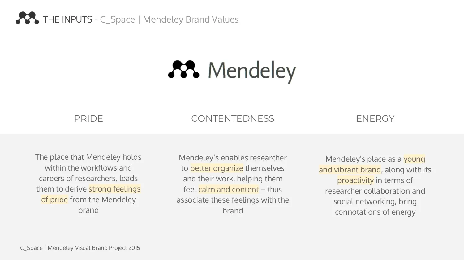
- C_Space - Mendeley Brand Values (2015)
- Elsevier Integrated Brand Strategy (3rd Annual Report, 2016)
- NPS report (2016)
- Marketing Acquisition migration plan
- Tone of Voice development
- Business strategy
- Review of Existing Equity
Analysing the inputs
I began sifting through the inputs, pulling out relevant signals to play back to the group, provoking discussion.
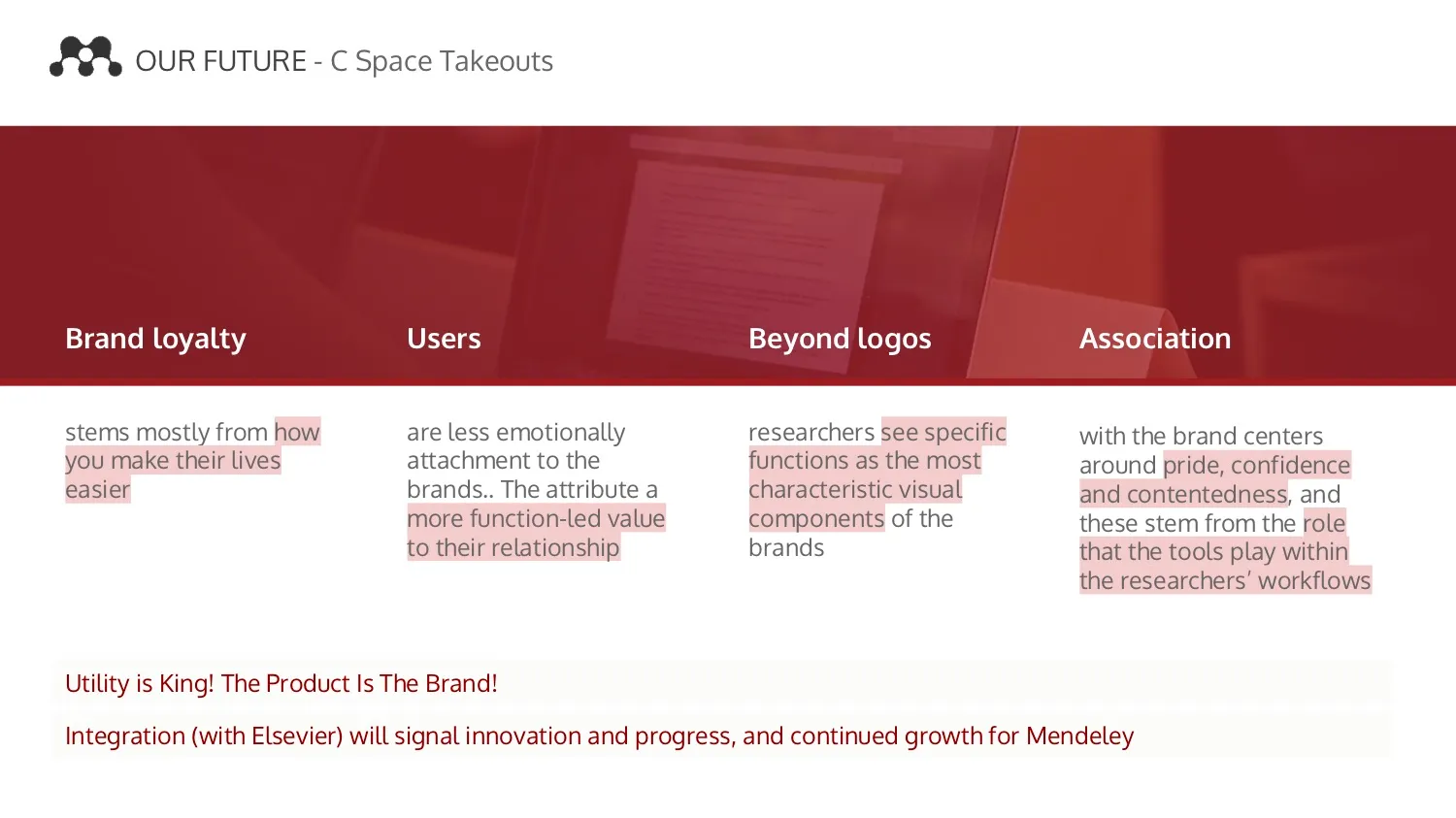
The team agreed that Mendeley was in the midst of a 'Brand Transition' and, at this point, this was not to be a rebrand but the beginning a greater alignment with Elsevier’s brand strategy.
There had recently been a refined a set of brand values completed and work was underway on the tone of voice guides that had begun to converge more closely with Elsevier’s guidance.
Competitive analysis
A preferred solution from Elsevier Masterbrand team had long been to drop Mendeley logo, adopt the Elsevier typeface, Nexus, and switch to the Elsevier orange.
At the time they had very tight governance on brand architecture and strategy and were keen to use this as an opportunity for Mendeley to fall in line.
However, in surveying the competitive landscape, it seemed that many competitors at the time were also branded with orange, so felt it was important to play this back to the group in order to visualise the impact in the market place.

Our visual equity
In fact, a recurring theme from verbatim user feedback indicated that Mendeley's most recognisable (and only) visual assets in play was our logo and signature red.

To remove these at this stage would mean receding into the competitive brandscape.
Our human equity
Undoubtably Mendeley's visual equity was most impactful in the context of the academic environment.
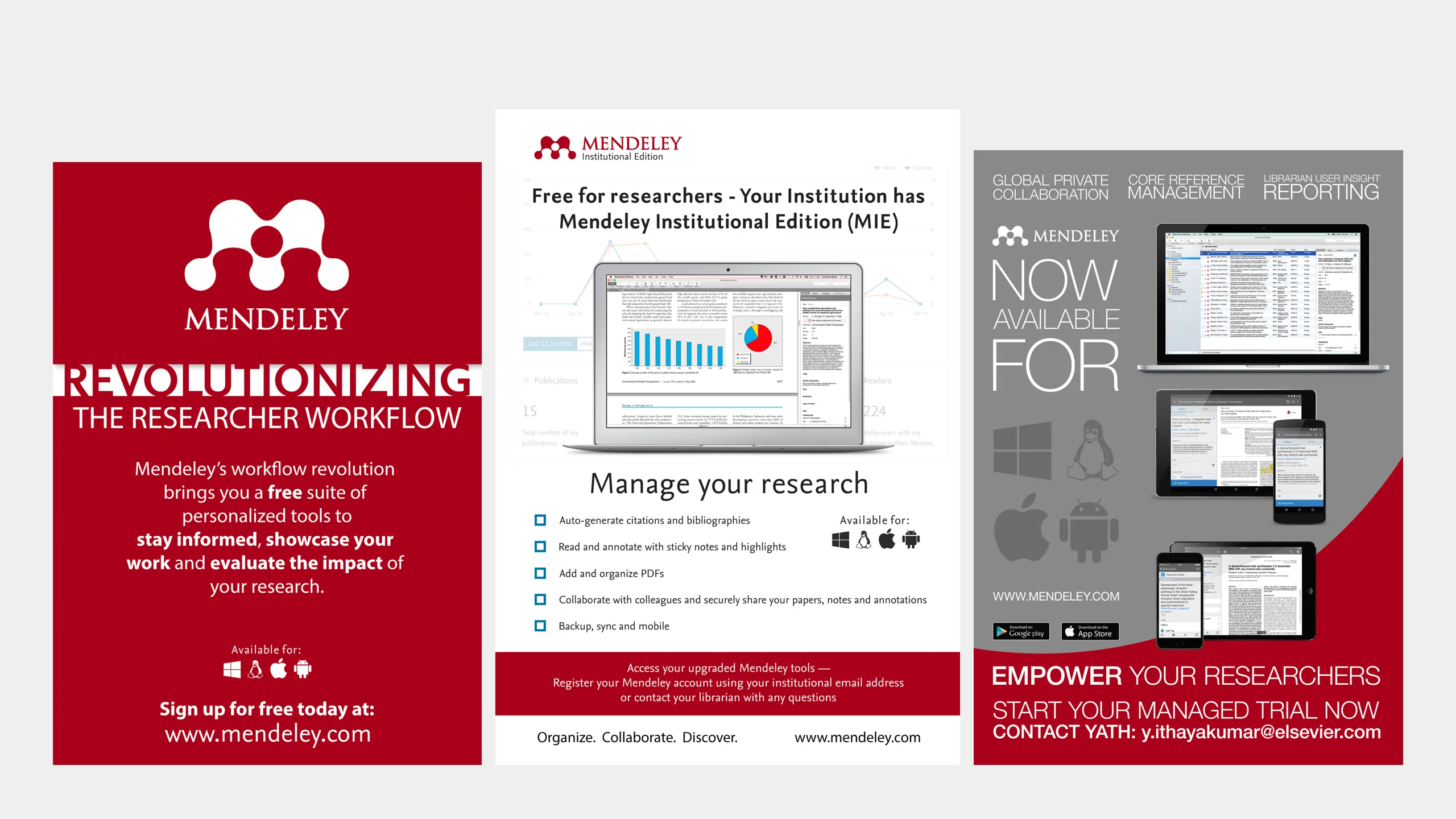
The marketing team had gone to great lengths to build strong relationship with power-users who really, really f**king loved Mendeley.
Actively nurturing the group into global community of product evangelists, they received support running workshops and tutorials, education materials, marketing materials and merchandise.
We'd regularly receive photos back from events that told a great story of our impact, without writing a word.
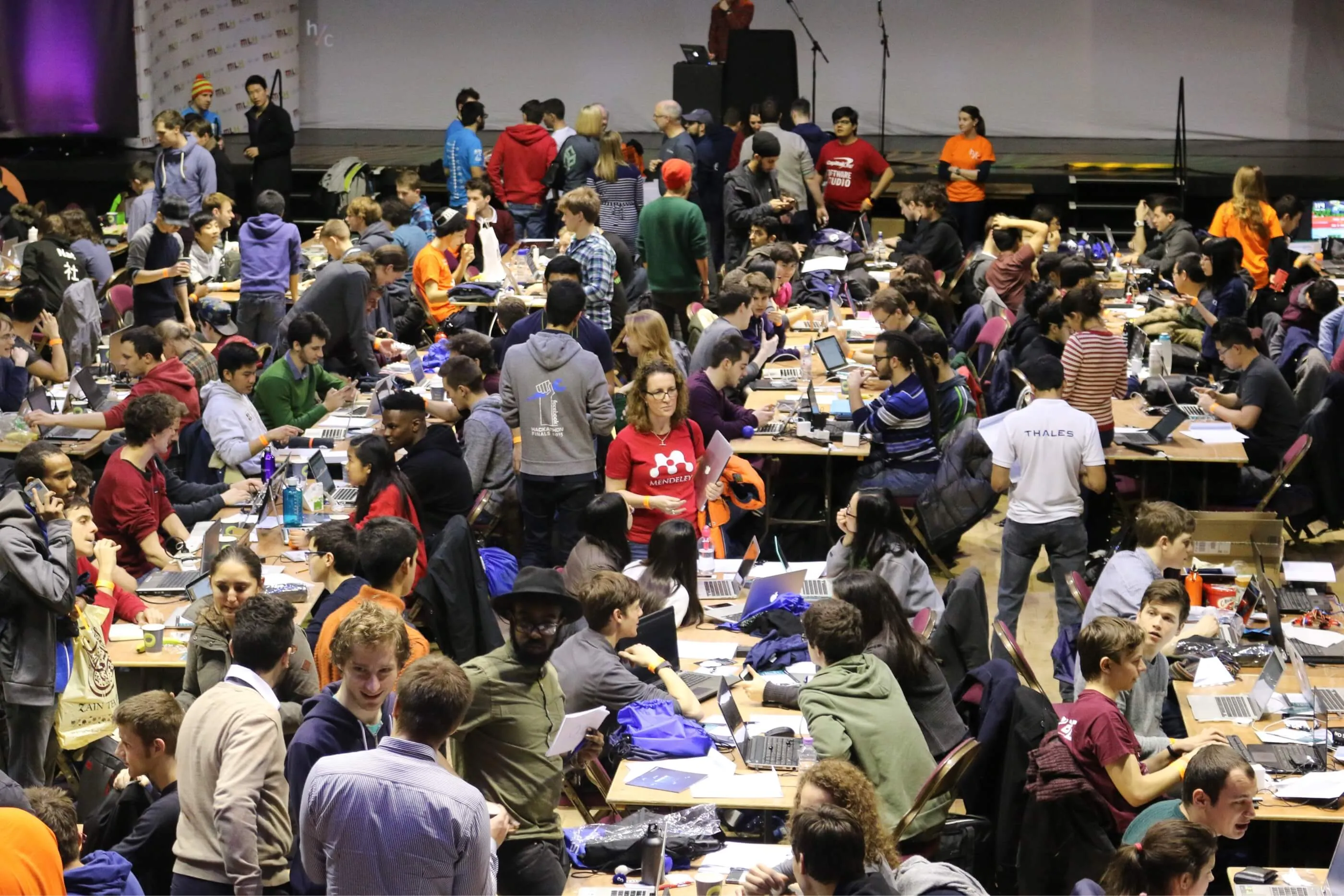
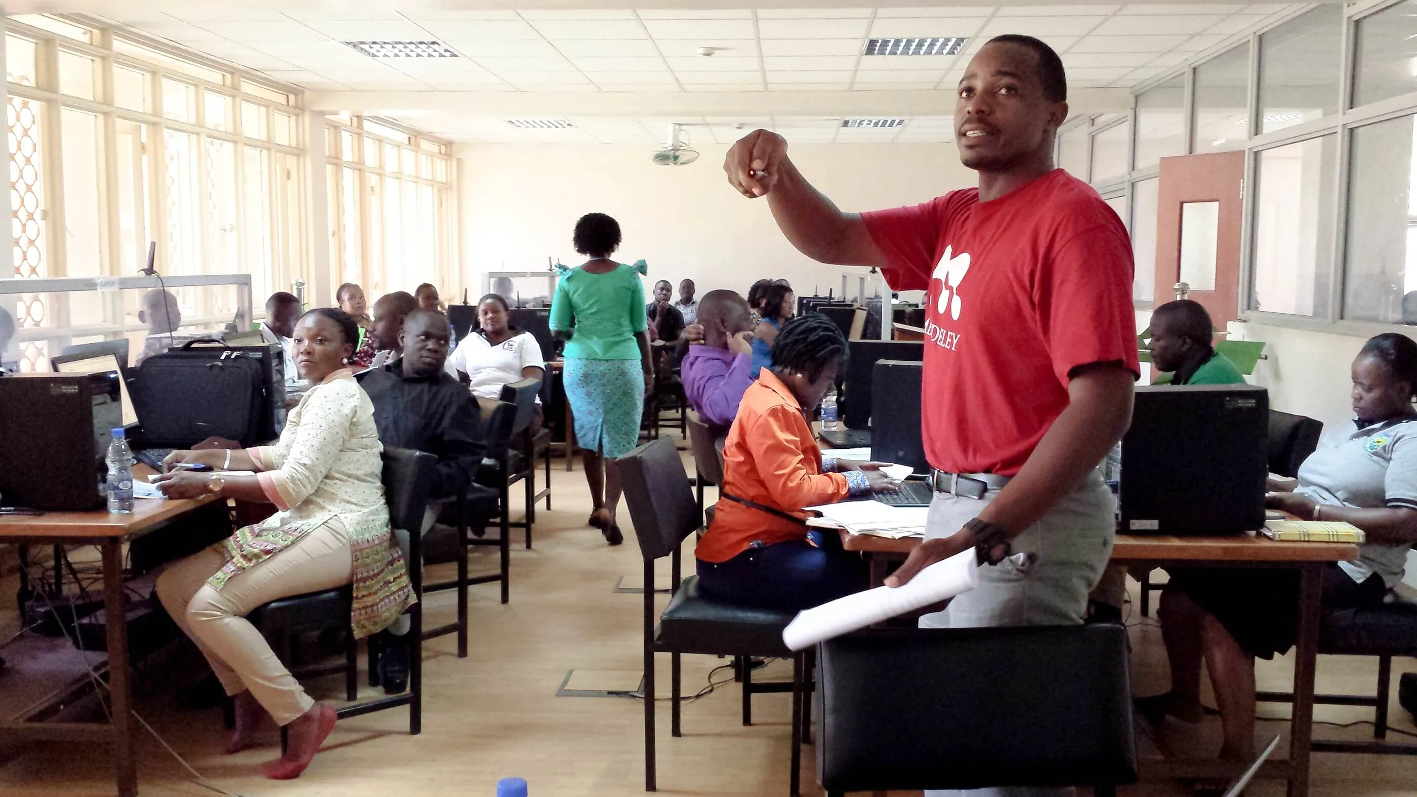
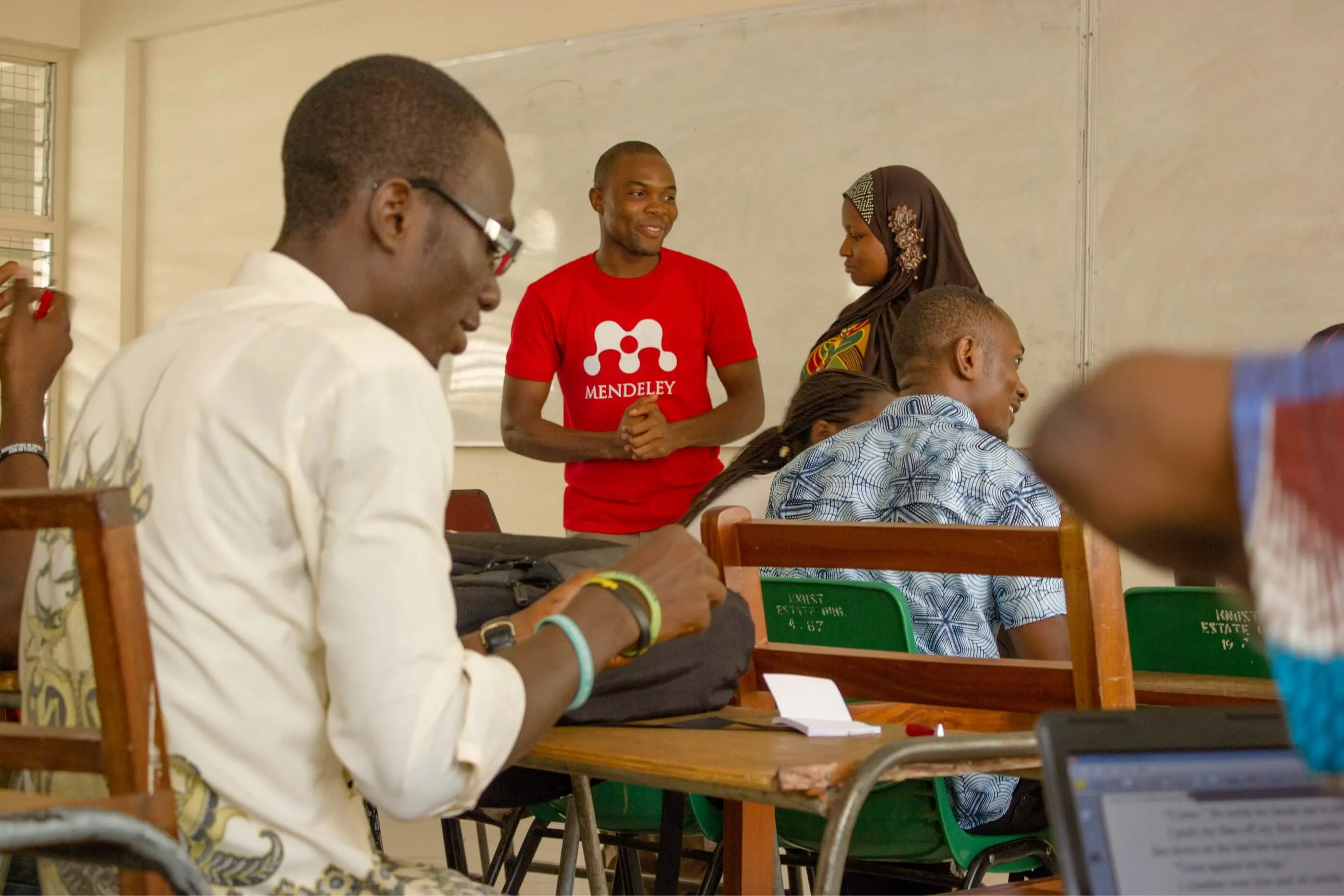
I flagged this as our most valuable equity and our greatest opportunity for communicating the impact of Mendeley, which I later leveraged when developing the I Am Mendeley campaign, in 2018
R&D Output
Having facilitated the Brand Equity workshop in order for the business to agree what is and isn't important, we came away with an agreement on a concrete path forward.
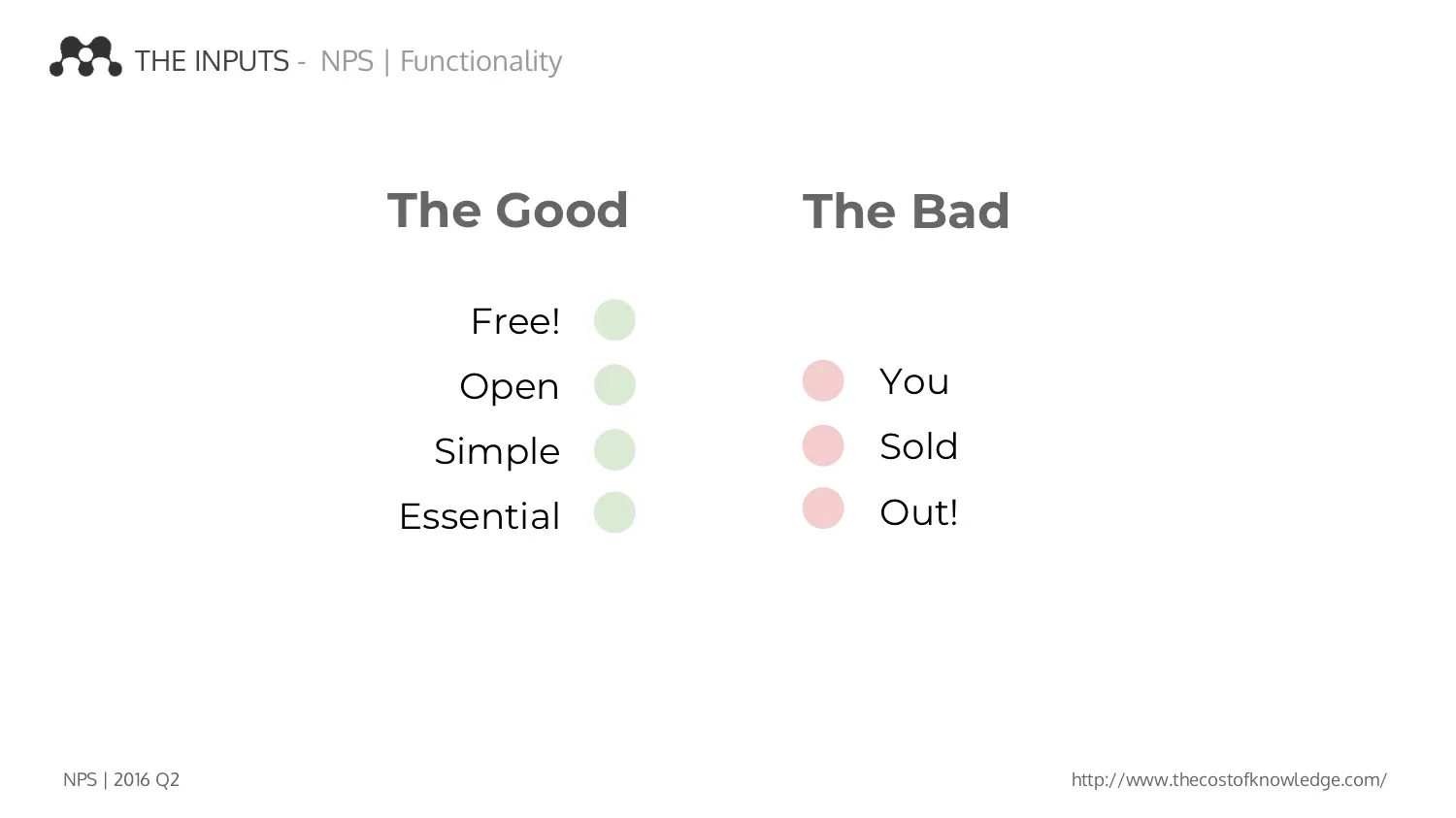
By triangulating all the signals from the business, research and user feedback, the our brand values were crystallised.
- Utility is King!
- Red is the colour!
- The Product Is The Brand!
- Our users are our greatest equity
Exploration and Ideation
// Finally - Design o'Clock!!!!
Whilst we'd spent a long time on R&D, agreeing on what was important, how we should approach the task and what is sacred, I was also itching to begin work on exploration and, in fact, I had already begun some investigation in tandem with the research phase.
Pretty much one of the first observations I'd made when joining the company was the roughly-drawn path that made up the logo.
The idea behind the logo was that it represented the letter 'M' in a form resembling 'metaballs', a computer-generated object of organic appearance.
I began researching the origins of the design and I learnt from the co-founder that the logo had been crowd-sourced in a competition and cost him very little as a result.
Curious to understand the underlying foundations of the design I began remapping the structure of the shape.
Upon doing so, I quickly discovered this logo had been formed, intentionally or not, using proportions very close to that of the Fibonacci ratio.
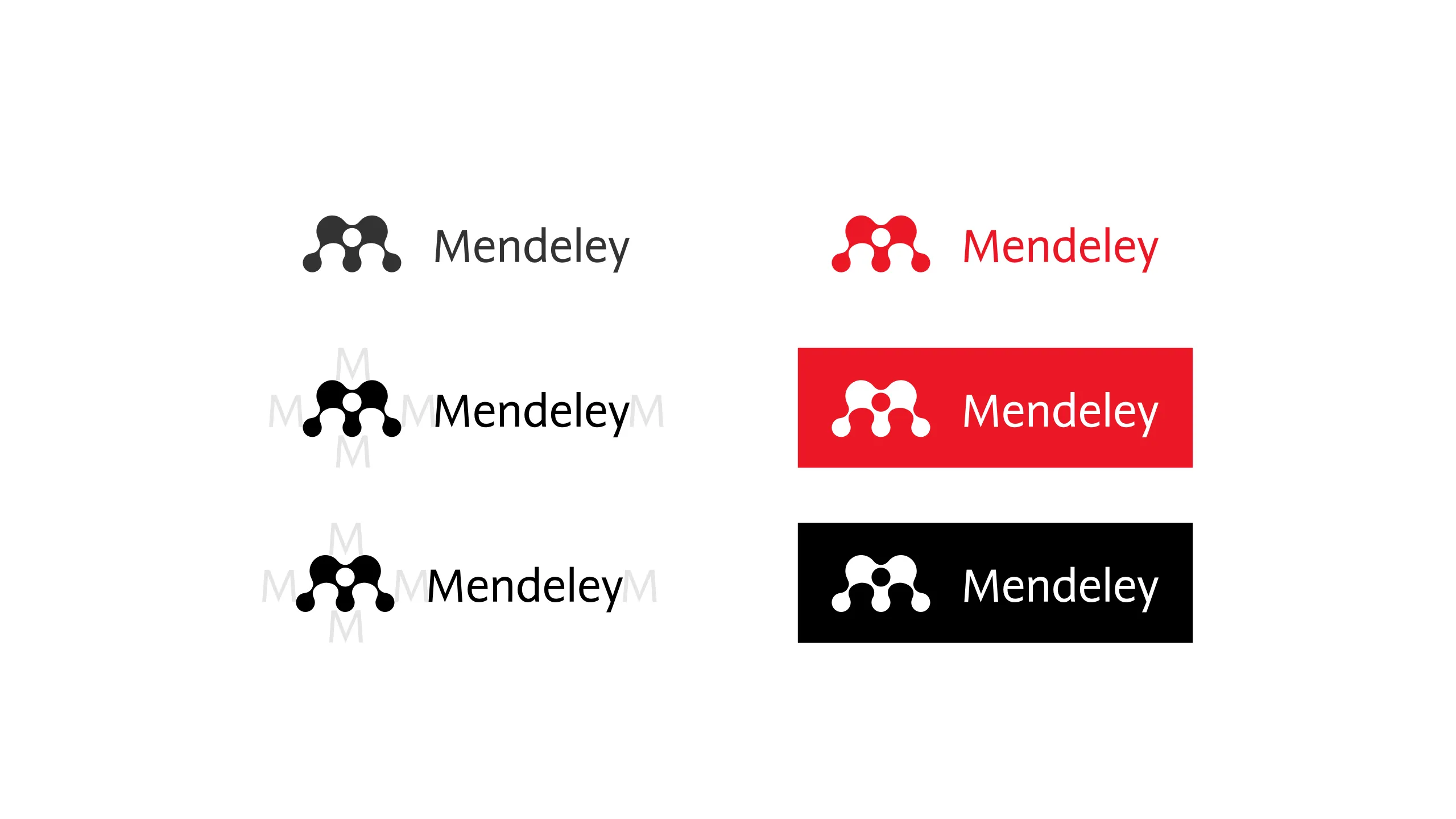
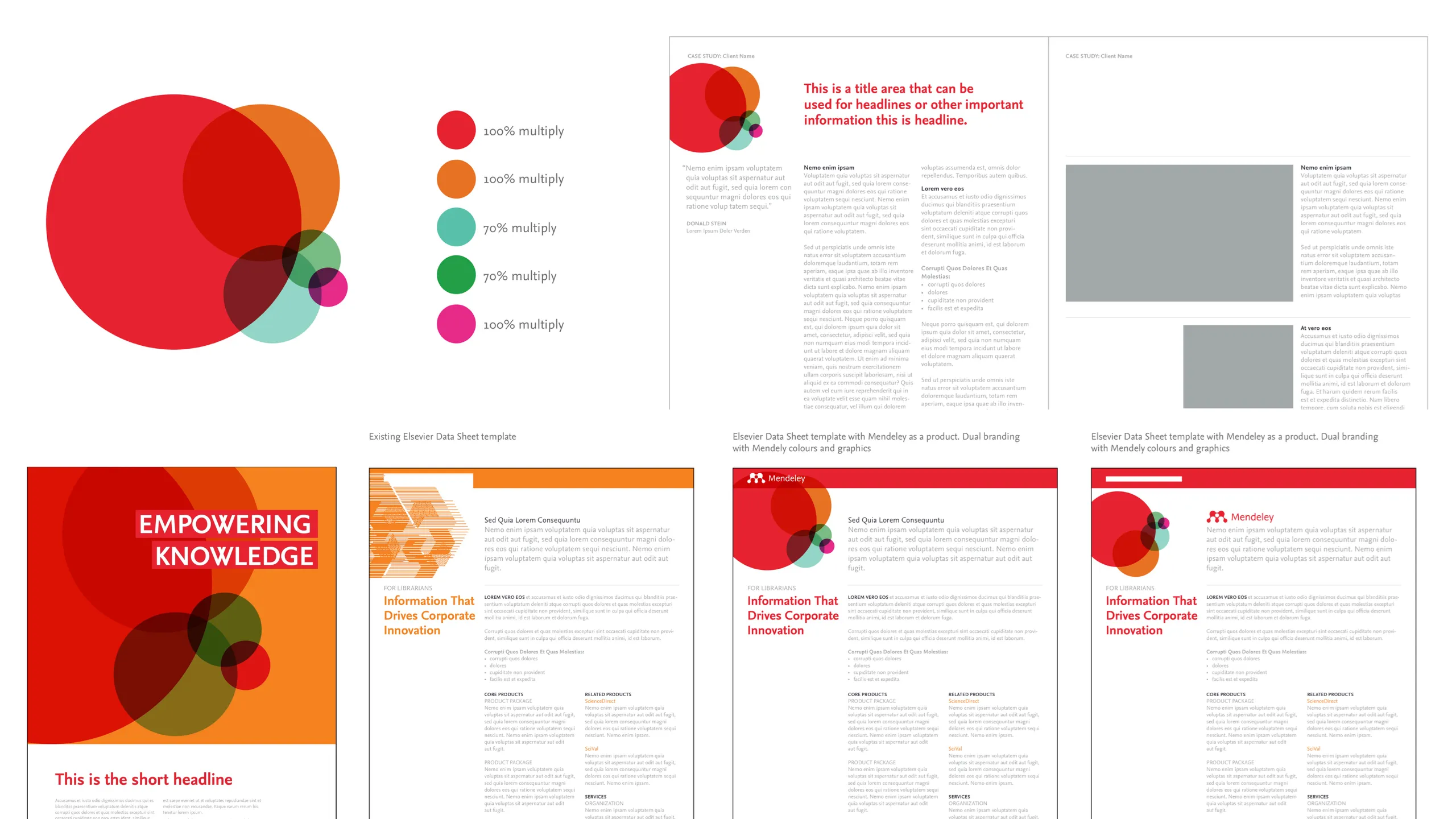
Repairing the Logo
In the interests of promoting an attention to quality as part of the work, I improved the logo composition with greater geometricity, unearthing a hidden logic within our logo.
I skipped through numerous iterations, looking to find one as close to the original logo as possible. The aim was to repair and strengthen the idea through the use of the circles, not destroy it!
Adopting the Wordmark
Inline with Elsevier brand strategy, we quickly adopted the Nexus Wordmark font in order to complement the Mendeley logo.
Harmonising with Elsevier orange
At the same time, it was felt important to address the issues of colour.
Whilst it was agreed that we should retain the red, it was felt important to do some work to better harmonise this with Elsevier's dominant orange.
Upon analysing the differences in brightness and saturation, I equalised the Mendeley red, to harmonise the presentation of the brands in unison.
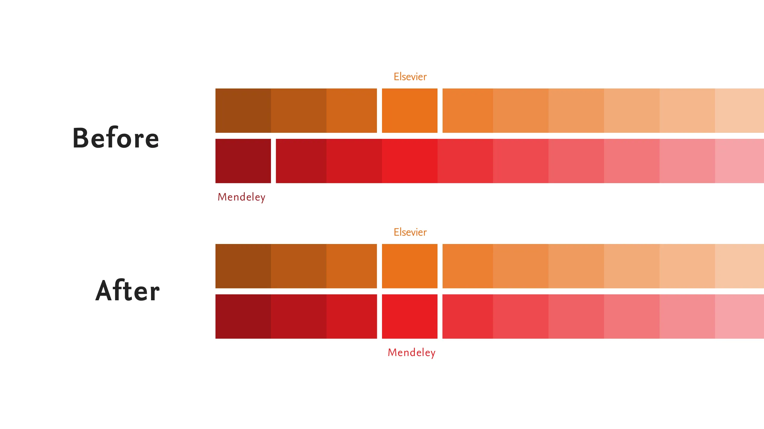
Using this improved relationship, I then developed a series of secondary colours to broaden our stylistic reach.
Taking a cut of the spectrum on this harmonised range, I introduced tints of Elsevier orange back into the palette to create a set of modern colours that sits well in with Elsevier livery.

Extending the visual language
The discovery of the circular genetics in the logo gave us the the opportunity to leverage the circle as part of the extended visual language, relying more heavily on them as a graphic device to represent the brand beyond the colour and logo.
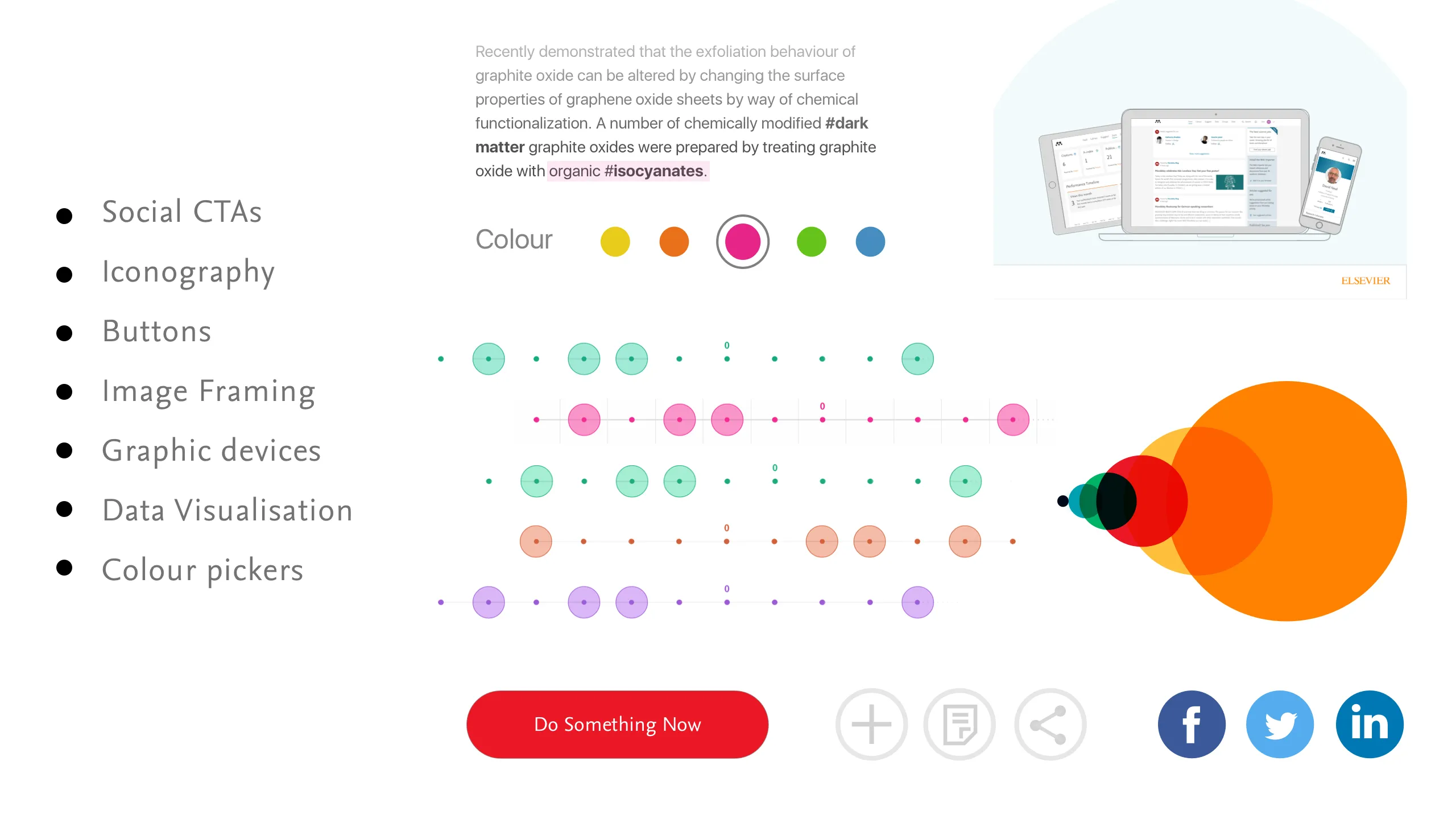
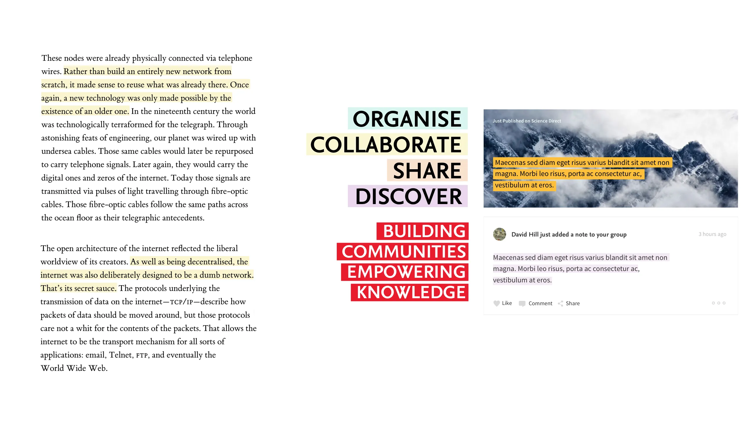
Highlighting our functionality
Another visual hook we felt we already own is that of highlighted text.
Not only would it help to draw the eye and enable a skimmable reading experience, it also directly echoes the functionality that we’re promoting.
The highlighted text is a simple ephemeral cue which allows us to amplify content and values in a style identifiable to Mendeley users and of great visual impact, both online and offline.
Evolving the collateral
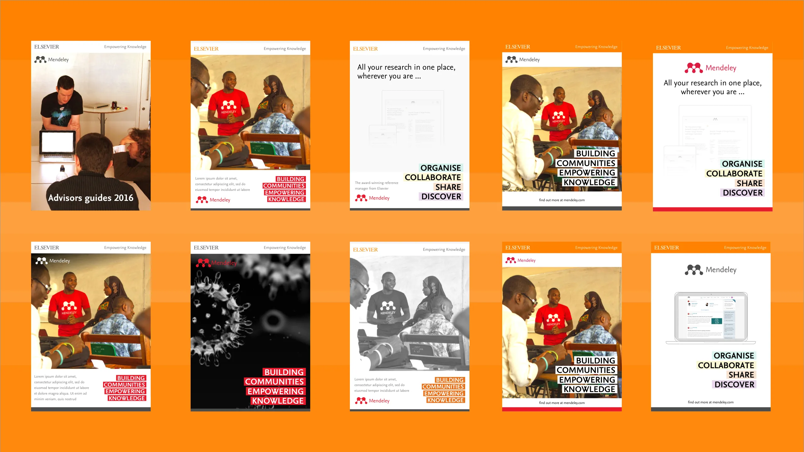
It's easy to get carried away with visual language development in relative isolation, but it's important to ensure application and execution is meeting its intended goals. Here, a key goal was to better balance the brands and as such, exploring a multitude of options before settling on a set of applications.
We'd been asked to use some pre-existing Elsevier templates, which made the task of application/execution straight-forward once we'd arrived at a preferred version.
Developing the guides
With the project was over-running, purely through issues of stakeholder availability, I quickly outsourced the remaining work to a freelance remote resource, who began working productionising templates, laying down the guides and visualising merchandising as I began to focus on the UI design refresh work.
Best laid plans.. and intended next steps.
The work was launched internally at the end of March yet, within a couple of months, the Mendeley marketing team got swallowed up in a global reorg of Elsevier's marketing function.
The logo, wordmark and retuned brand colour were picked up, along with some of the circular motifs for using across social media and some of the collateral templates were adopted and iterated, but a full roll out never materialised due to a centralised strategy emerging as part of the reorg.
Periodically, I continued to support the marketing teams when I could, most notably the development of a powerful marketing campaign. exuding the new values we arrived at during this project.